Carbo.
Understand today. Protect tomorrow — a calm, green mobile app that turns abstract emissions into a daily, trackable habit for individuals, families, and companies.
- Role
- UI/UX Designer
- Type
- Mobile · Sustainability
- Screens
- 10 final
- Tools
- Figma · Lovable · ChatGPT
Climate action, sized to a single tap.
Carbo is a personal carbon-footprint companion. It collapses the gap between climate awareness and climate action with a single loop: log an activity, see its impact, get a reduction tip — repeated until 'lower than last month' becomes the default.
Most carbon apps measure guilt, not progress.
Three personas, one footprint.
First-time trackers who want a low-friction way to know whether their week was greener than the last — without learning what a tCO₂e is on day one.
Households who share emissions and want one combined dashboard for travel, energy, and food — with per-member contributions visible.
Sustainability leads enabling employee tracking to hit ESG goals — the same logging surface, aggregated into a company-wide footprint.
Users motivated by streaks and goals — Carbo's day-streak tile, 72% monthly-goal ring, and Daily Tip carry the gamification without trivialising the topic.
Five tabs around a single + button.
Home is the headline number and goal ring. Activity is the full history with streaks. Track is the daily KPI board. Profile is settings. The center + FAB launches the 4-step Add Activity wizard from anywhere in the app.
Ten screens, one daily habit.
Each screen earns its place in the loop. Captions explain the decision, not the obvious.
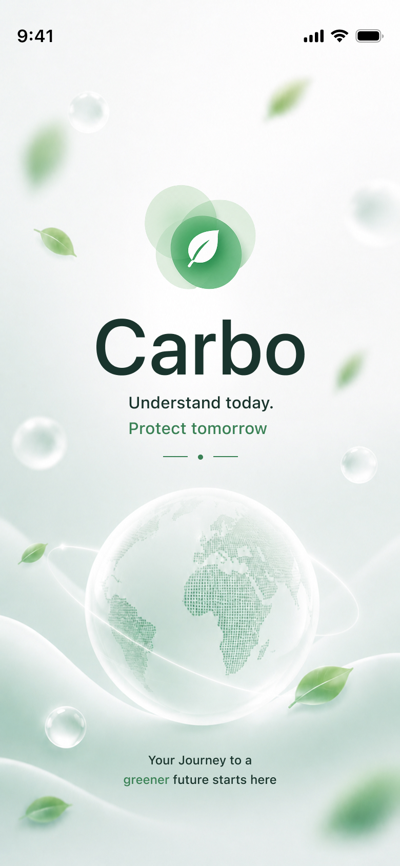
The Carbo mark over a glassy globe and drifting leaves sets the tone — 'Understand today. Protect tomorrow.' arrives before any data does.
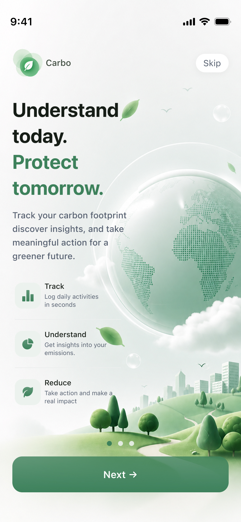
Three-line promise (Track / Understand / Reduce) carried by an illustrated earth. Skip is available, but the primary path is a single Next button.
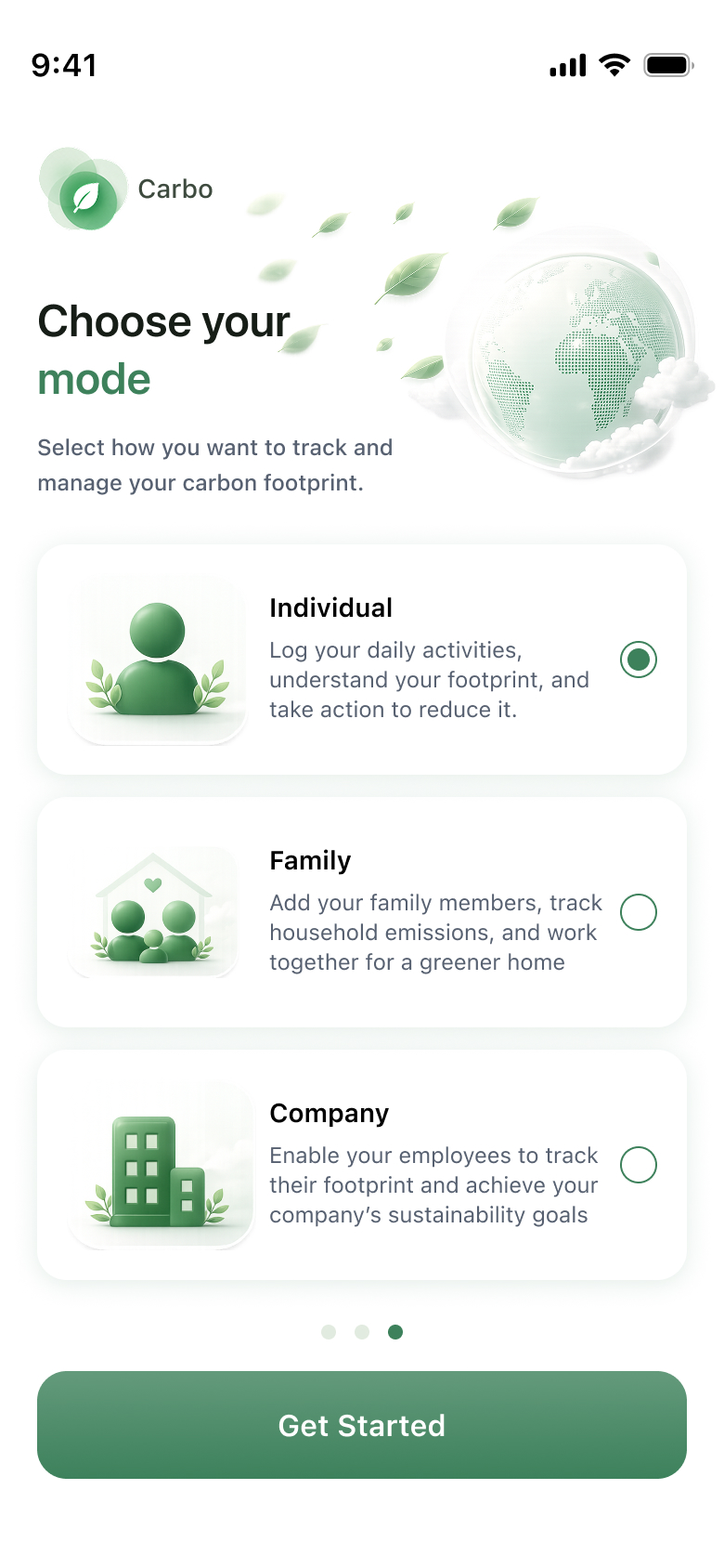
Individual, Family, or Company — one decision rerouts the whole app's data model. Selection lives on illustrated cards, not a dropdown.
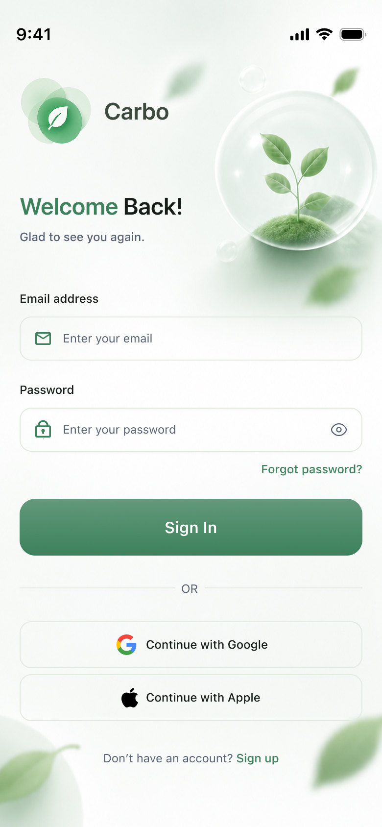
Calm welcome screen with a glass-globe illustration. Email + password, Google and Apple sign-in, and a soft Sign-Up affordance underneath.
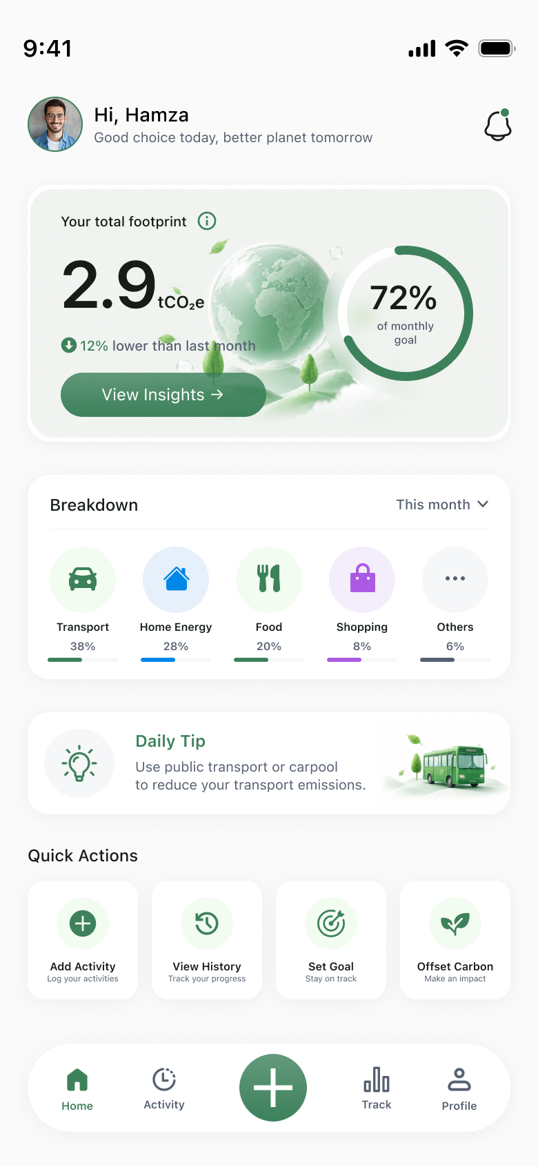
Total footprint headline (2.9 tCO₂e) framed positively ('12% lower than last month'), monthly-goal ring at 72%, category breakdown bars, Daily Tip, and four Quick Actions.
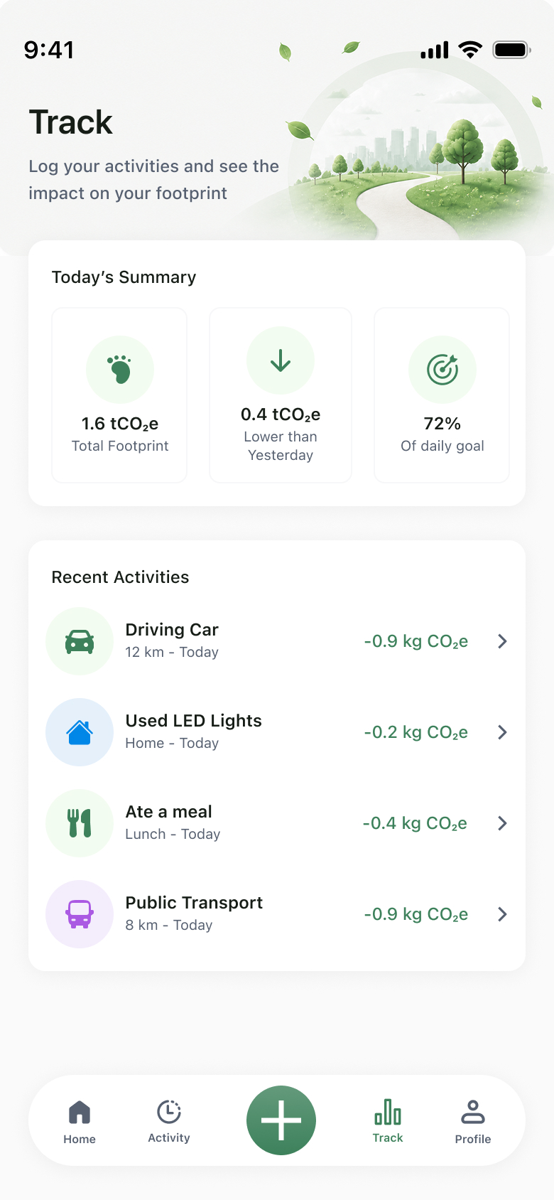
Today's Summary with three KPI tiles (Total Footprint, vs Yesterday, % of daily goal) over a Recent Activities list — each row shows the activity's CO₂e saving in green.
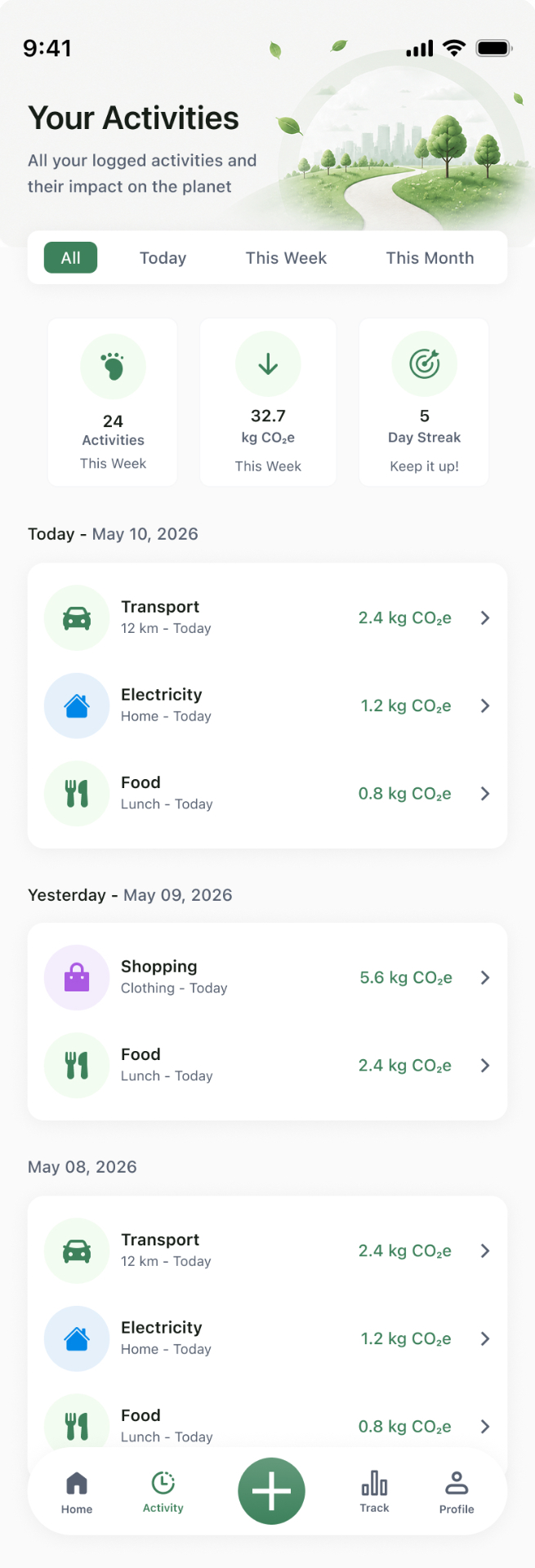
All / Today / Week / Month segmented tabs, a streak tile (5-day · Keep it up!), and grouped day-by-day history so progress is visible without a chart.
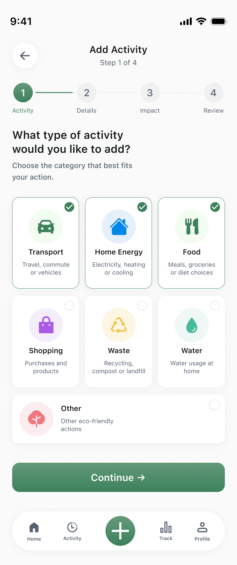
A 4-step wizard with a numbered progress rail. Step 1 is a 6-tile category grid (Transport, Home Energy, Food, Shopping, Waste, Water) plus an Other escape hatch.
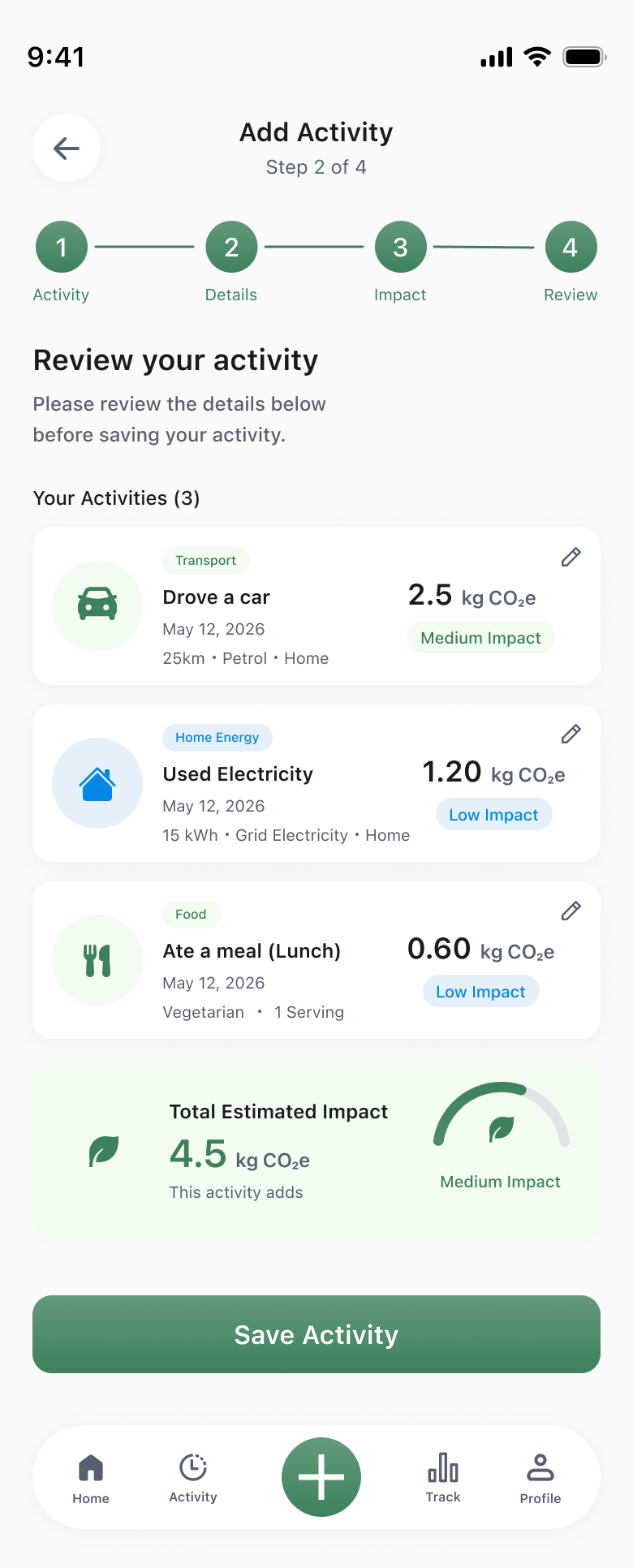
Step 4 stacks every logged activity with category, kg CO₂e and a Low/Medium/High impact chip, then a Total Estimated Impact tile with a gauge before Save Activity.
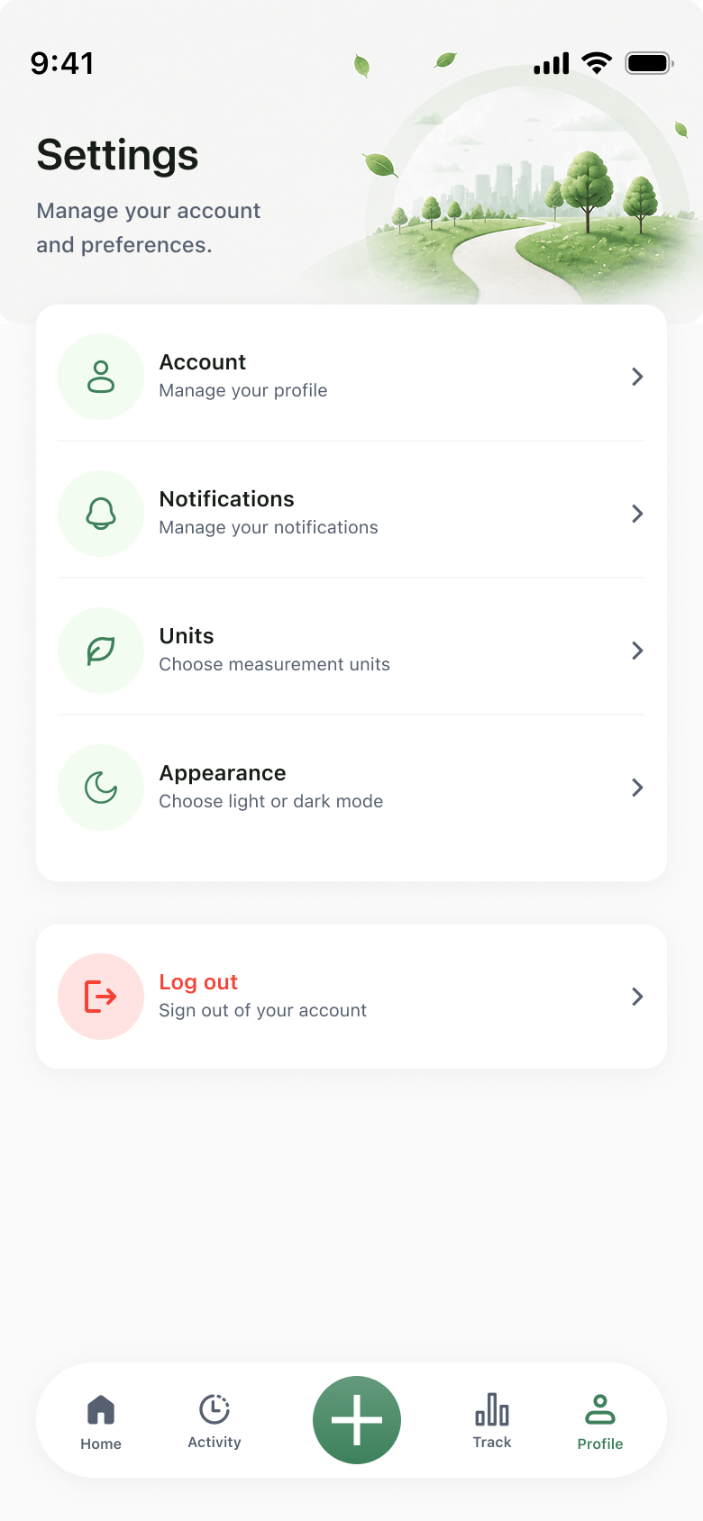
Account · Notifications · Units · Appearance grouped in one card, with Log Out separated as a destructive row — illustrated header keeps the screen on-brand.
Six choices shaped the app.
Activity → Details → Impact → Review. The numbered rail at the top of every step removes the 'how long is this?' anxiety that kills logging mid-flow.
Every activity gets a Low / Medium / High impact chip and a colored gauge — kg CO₂e on its own is abstract, the chip makes the trade-off legible at a glance.
A center-anchored green + button on the tab bar is always one tap away. Logging is the core loop; the rest of the navigation orbits around it.
'12% lower than last month' sits next to the total, with a 72% monthly-goal ring — Carbo is a coach, not a scoreboard. Guilt doesn't change behaviour; momentum does.
One onboarding question forks the data model. Families share a household total; companies enable employee tracking — same surface, three personas.
Each top-level screen wears a different green illustration — globe on Splash, hills on Track, cityscape on Profile — so navigation feels like moving through a place, not a menu.
Sage on ivory, soft on serious.
A single forest green carries every primary action and chart accent over an ivory canvas, with leaf-sage tints standing in for secondary surfaces. Illustrated headers — glass globes, drifting leaves, rolling hills — give every top-level screen a place feeling. Impact statuses use a tight palette: green (low), gold-green (medium), red (high).
A coach in your pocket.
Carbo replaces a category of guilt-driven dashboards with a quiet, repeatable loop — log, see, reduce. The Individual, Family, and Company modes mean the same screens carry a hobbyist, a household, and an ESG team without forking the product.