Shahin.
Smarter Tracking. Stronger Logistics — a full redesign of LogEye, Shahin's fleet-tracking platform, from a legacy Bootstrap UI into a calm, modern command center for 388+ trucks across KSA and the GCC.
- Role
- UI/UX Designer
- Type
- Web Dashboard · Fleet
- Screens
- 5 redesigned
- Tools
- Figma · Lovable
A legacy fleet console, reborn as a command center.
Shahin is a Saudi logistics operator running a live fleet of 388+ trucks across KSA and the wider GCC. LogEye is their internal tracking platform — every dispatcher, controller, and ops manager starts their shift here. The legacy app was a Bootstrap-era dashboard: candy-colored tabs across the top, status pills competing with the brand, and a 3-column form that called itself a Location Manager. The redesign keeps every capability, but gives the workspace a single clear voice.
Capability buried under colour and chrome.
The before screens carried real power — live tracking, alerts, geofences, trip detail — but the surface fought the user. Nine top-nav items in mixed weights, status counts as red/green/yellow pills, a gradient login with no product context, and an Alerts screen that summarised eight categories as a row of red chips with no severity hierarchy. The map — the entire point of the product — was wedged in beside a dense table.
Built for the people who never close the tab.
Monitor 300+ trucks live across KSA, GCC, and cross-border routes. Need fleet health in one glance and one-click drill-down into any alert.
Start, stop, and reassign trips, configure geofences, and acknowledge alerts in real time. Speed and pattern consistency matter more than visual polish.
Read reports, summaries, and SLA breaches. Need exportable tables (Excel) and a calm reading surface for long monitoring shifts.
Arabic-first staff working alongside English-first SaaS — the system has to read cleanly in both directions without rebuilding the layout.
Strip the chrome, promote the data.
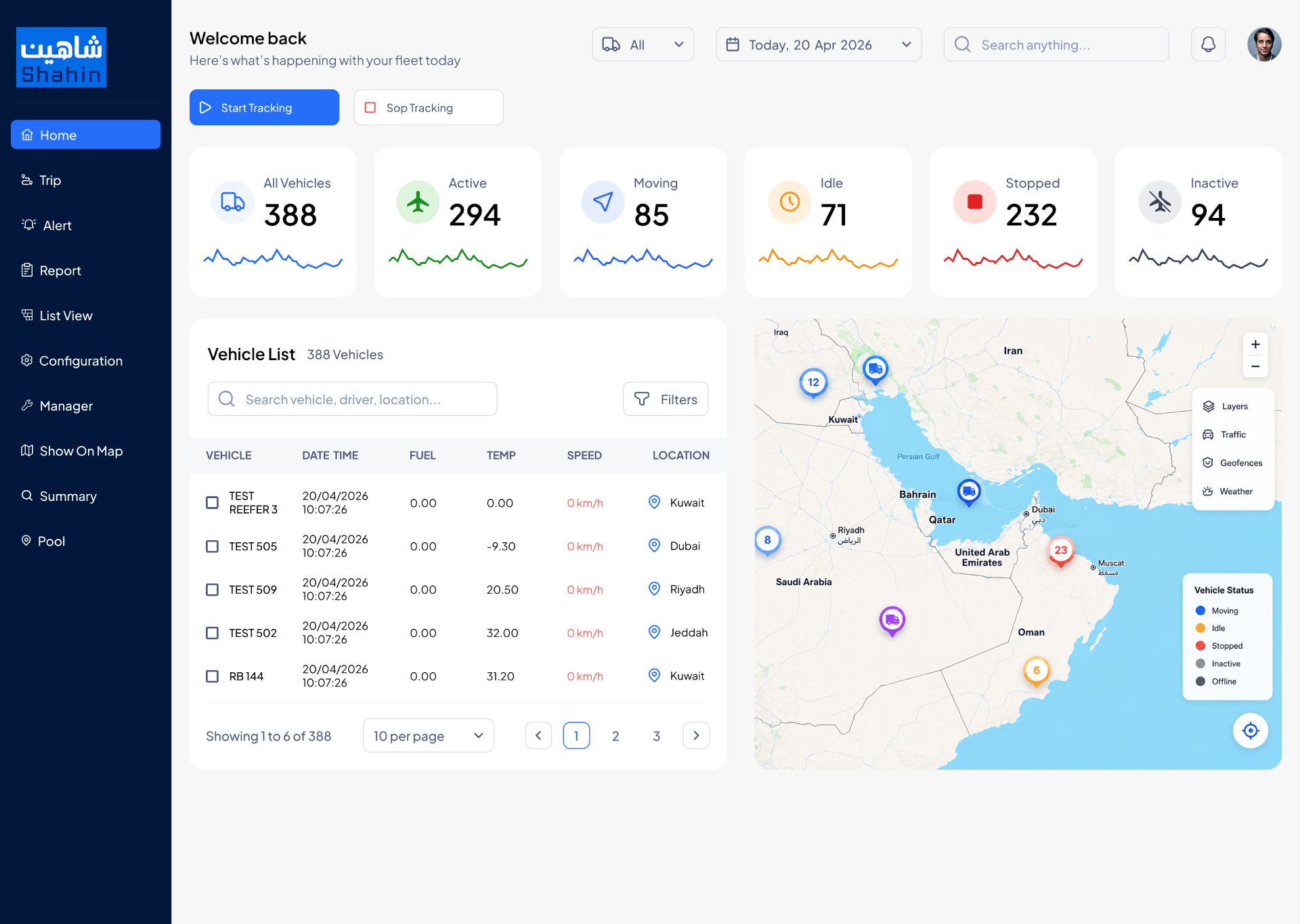
The redesign followed four rules. One: collapse the top tab strip into a persistent left rail so the workspace owns the screen. Two: promote status counts into KPI cards with sparklines and semantic icons. Three: collapse the rainbow palette to a single brand blue plus status dots that actually mean something. Four: make the map a first-class panel — toolbar, legend, layers — not a backdrop behind a table.
Five screens, side by side.
The captions explain the decision, not the obvious.
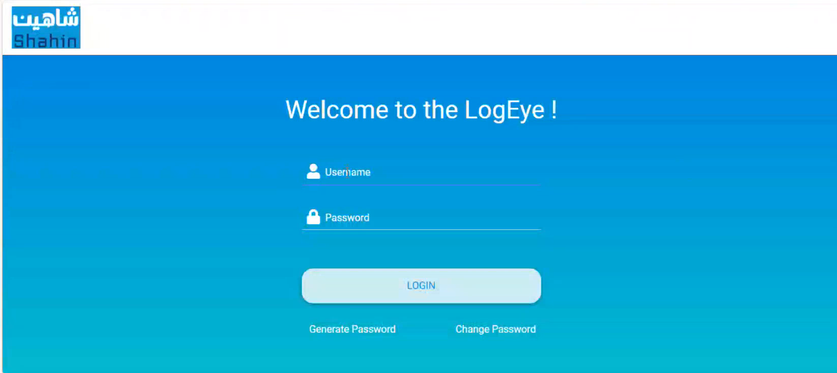
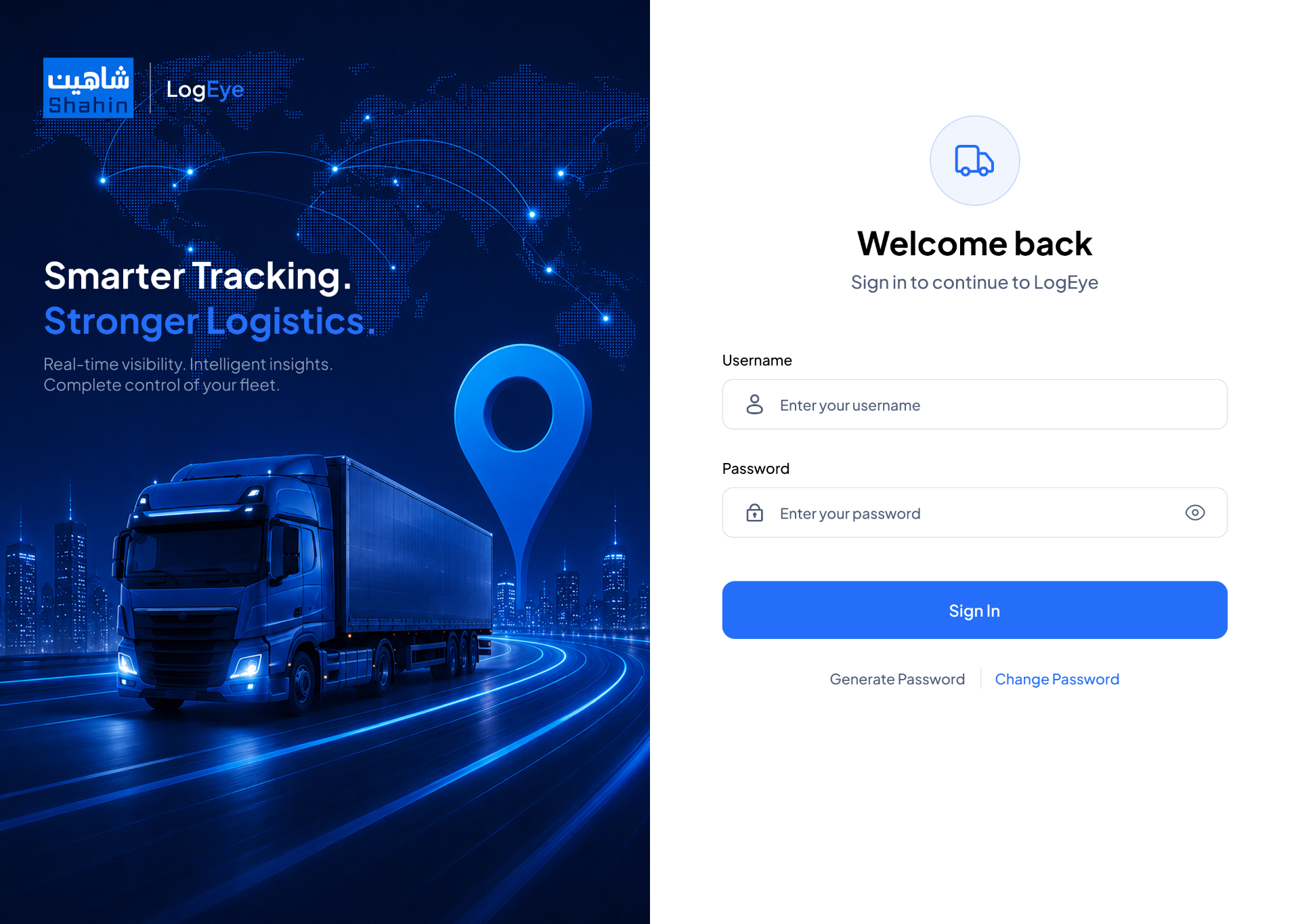
The legacy screen leaned on a blue-cyan gradient and a hollow LOGIN button with no product context. The redesign splits the canvas: a cinematic truck-and-network hero on the left tells the LogEye story, while the right pane is a focused, accessible form with proper labels, show-password, and a primary Sign In CTA.
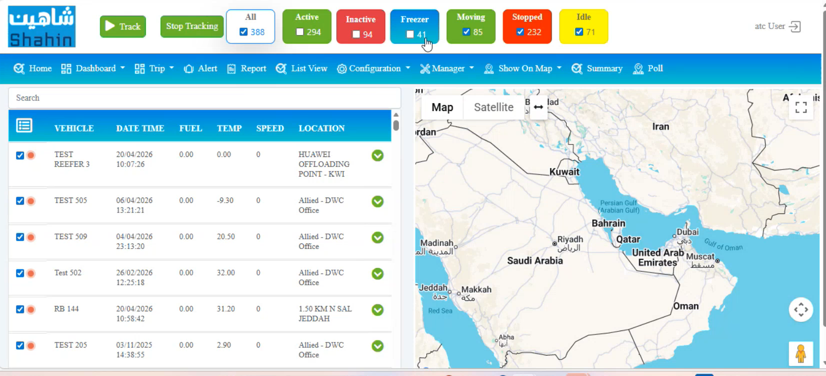
Status counts were jammed into colored pills competing with the brand mark, with the map fighting a dense table for screen real estate. The new home anchors on six KPI cards with trend sparklines (All Vehicles, Active, Moving, Idle, Stopped, Inactive), a clean vehicle list, and a first-class map with legend and layers.
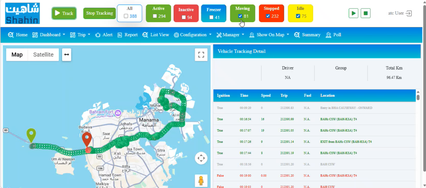
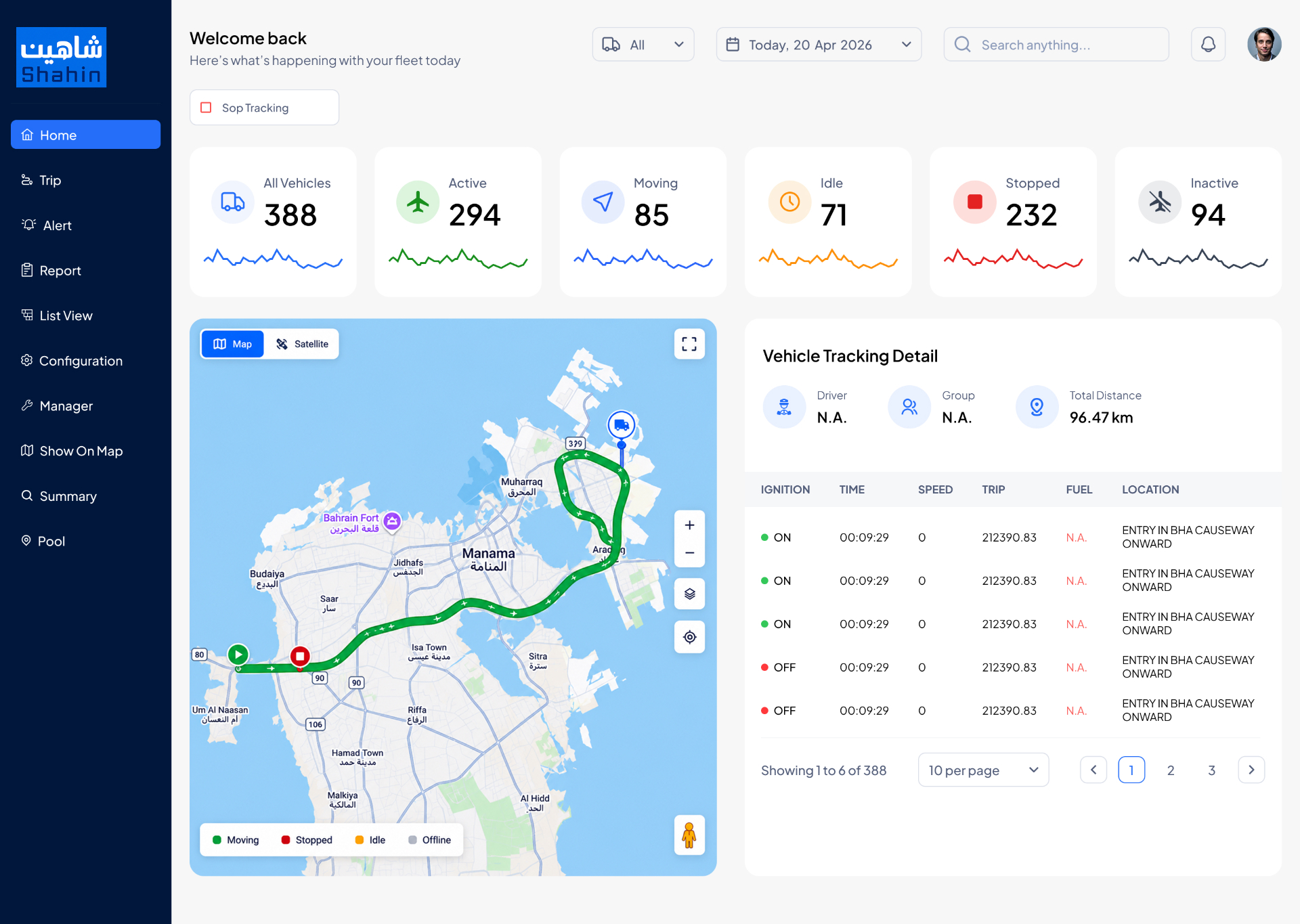
The before view stacked a tracking detail header above a noisy true/false ignition log. The redesign keeps the map full-bleed and lifts the metadata — Driver, Group, Total Distance — into a summary row, then renders ignition events as scannable rows with semantic ON/OFF dots, pagination, and a sticky map legend.
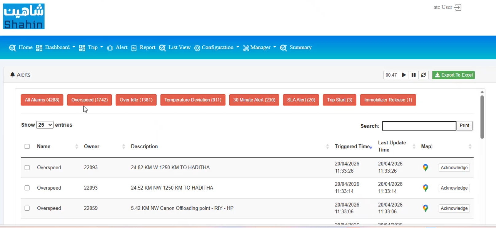
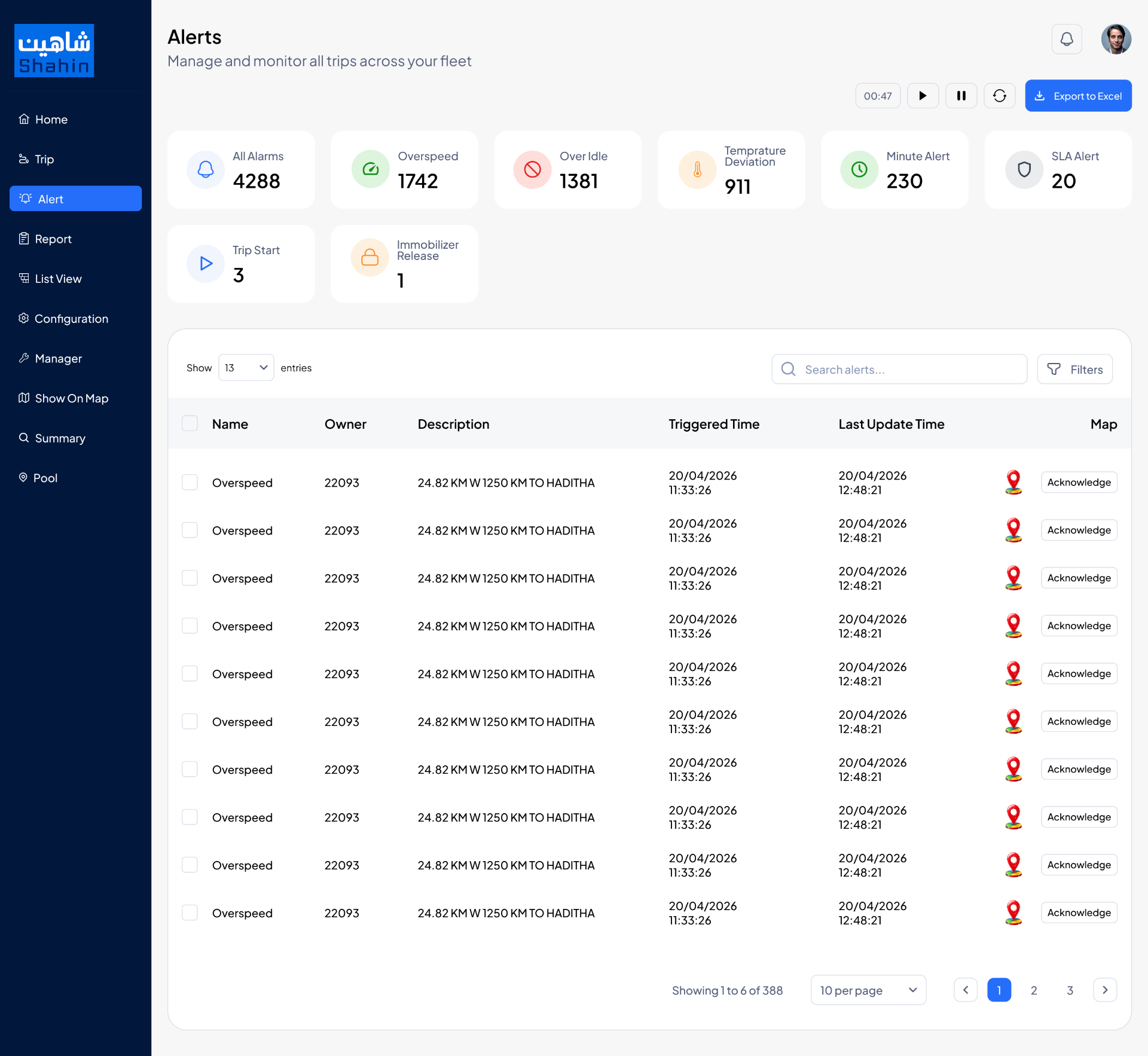
Eight alert types were squeezed into a single row of red chips with no severity grouping or trend. The redesign promotes each category to its own KPI card (All Alarms, Overspeed, Over Idle, Temperature Deviation, Minute Alert, SLA Alert, Trip Start, Immobilizer Release) with semantic icons, then a clean alert table with search, filters, and per-row Acknowledge actions.
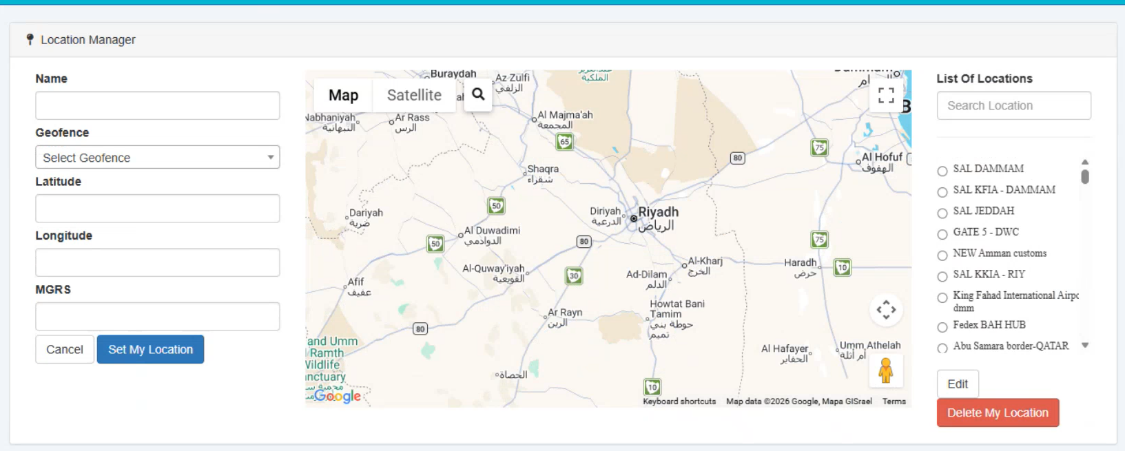
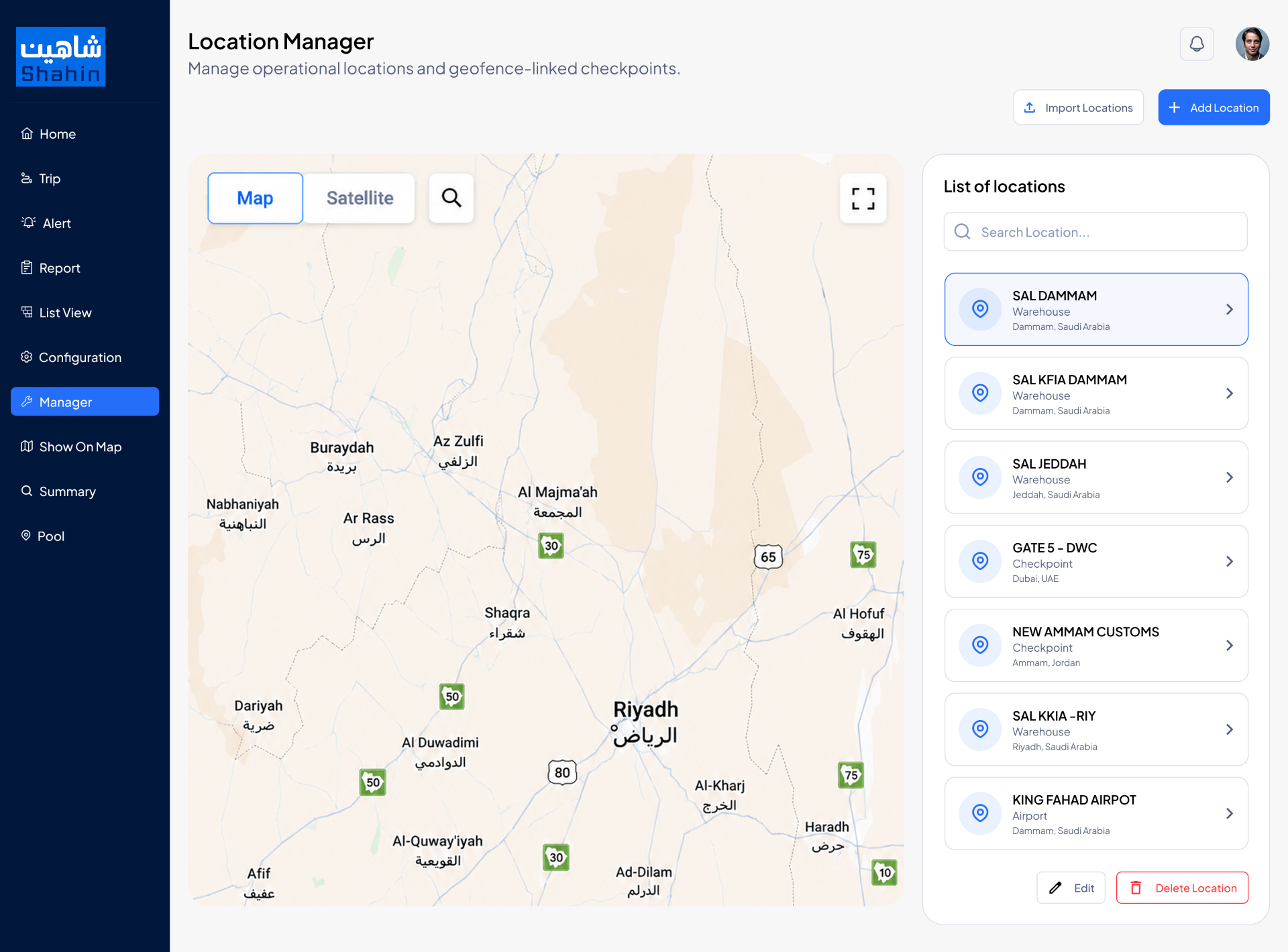
The before was a 3-column strip — fields on the left, narrow map in the middle, radio-list on the right — that made adding a single location feel like data entry. The redesign promotes the map to a full canvas, turns the locations list into rich cards (name, type, city, country) with primary actions floating above, and lifts Import / Add Location to the page header.
Six choices shaped the redesign.
Nine mixed-purpose tabs in the legacy header were collapsed into a persistent dark navy sidebar with clear primary destinations — Home, Trip, Alert, Report, List View, Configuration, Manager, Show on Map, Summary, Pool — so the workspace owns the rest of the screen.
Status counts that previously lived inside header pills are now first-class metric cards with sparklines and category-colored icons. A controller sees fleet health at a glance before reading a single row of data.
The before mixed red, green, orange, yellow, and two blues. The system collapses to a single action blue plus semantic status dots (Moving, Idle, Stopped, Inactive, Offline) — color now carries meaning, not decoration.
Every map view gets a real toolbar (Map/Satellite toggle, search, fullscreen, zoom, layers, traffic, geofences, weather) and a legend pinned in-canvas — the map is the data, not a backdrop behind a table.
Alerts, Vehicles, and Locations all share the same row rhythm — entries selector on the left, search + filters on the right, sortable headers, per-row primary action on the right edge, pagination footer. Learn it once, use it everywhere.
Shahin's brand is bilingual (شاهين / Shahin). Numerals are tabular, labels are sentence-case, and the grid is symmetrical so an Arabic locale can flip without breaking alignment.
Navy rail, blue action, calm surface.
A deep navy sidebar carries the brand and the primary navigation. A single action blue handles every primary CTA, active state, and data-viz accent. Surfaces are off-white with soft slate borders and gentle shadows; cards are rounded-2xl. Status uses semantic dots — Moving, Idle, Stopped, Inactive, Offline — so the same palette reads the same way on a map pin, a table row, or a KPI card.
A console controllers want to live in.
The redesigned LogEye keeps every legacy capability — live tracking, alerts, geofences, reports — but gives the surface a single clear voice. Fleet health reads in seconds, the map finally feels like the product, and the design system is ready for an Arabic/RTL flip without breaking layout. Shahin's internal tool now looks like the modern SaaS it competes with on the dispatcher's second monitor.