Zulfy.
The operator side of Zulfy — a barber-shop dashboard in your pocket for managing shops, staff, calendars, revenue, and the daily flood of booking requests.
- Role
- UI/UX Designer
- Type
- Mobile · Barber App
- Screens
- 10 final
- Tools
- Figma · Lovable · ChatGPT
A barber shop, run from a phone.
The Barber App is the operator half of the Zulfy platform. Where the User App is a calm booking experience for guests, this one is a working dashboard for shop owners — multi-shop accounts, live KPIs, a color-coded day view, staff management, and a gallery that doubles as the shop's storefront in the User App.
Shop owners run three apps to run one shop.
The operator side of the chair.
Single-location owners who cut hair and run the books — they need a dashboard fast enough to check between clients.
Owners running two to five shops who switch between locations from one bottom sheet — scoping every KPI to the active shop.
Lead staff invited by the owner with calendar and profile access, but no withdraw or delete permissions.
Mobile barbers who toggle home-service on their staff profile and accept on-location bookings from the User App.
Four tabs, ten screens, one shop in focus.
Home is the KPI + revenue dashboard. Staff is the team roster with invite states. Calendar is the day-scoped status board. Profile is account, language, legal, and the destructive Delete Shop control. The Add (+) button in the header is the universal entry to new shops, staff, or bookings.
Ten screens, one operator experience.
Each screen serves a working barber shop. Captions explain the decision, not the obvious.

Same monogram, same obsidian — the operator app shares the User App's identity so a shop owner switching between the two never feels they've changed brands.
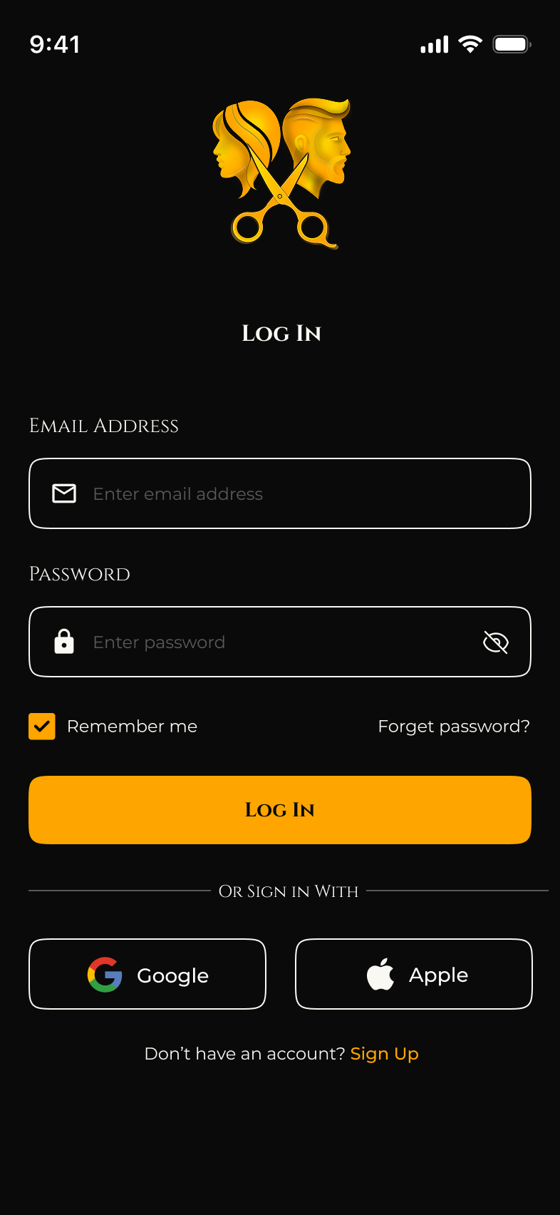
One column, social sign-in, Remember-me on by default. Operators log in once on the morning shift and stay in for the rest of the day.
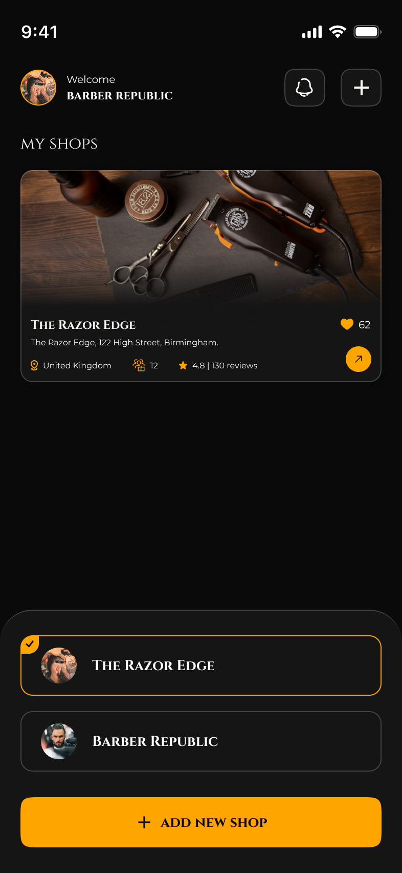
Multi-shop switcher in a bottom sheet — the active shop carries a gold checkmark, every booking and revenue figure in the app scopes to it, and a primary Add New Shop button sits below.
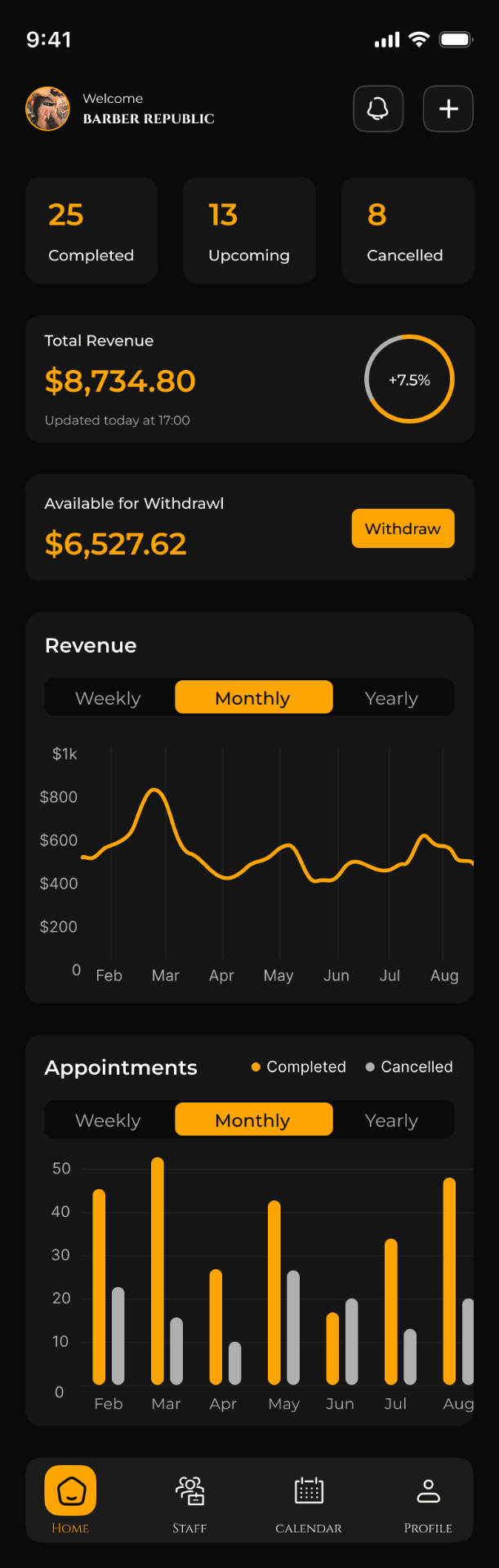
Three KPI tiles (Completed · Upcoming · Cancelled), Total Revenue with delta donut, Available-for-Withdraw with a Withdraw CTA, plus weekly/monthly/yearly Revenue line and Appointments bar.
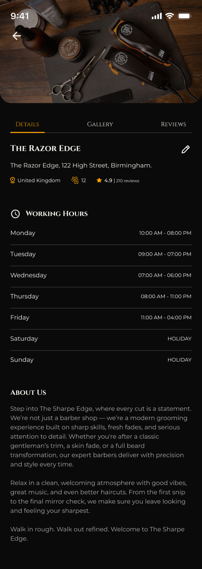
Details / Gallery / Reviews tabs over the shop hero. Working hours render as a clean two-column table with HOLIDAY tags, and the About copy is editable inline via the pencil icon.
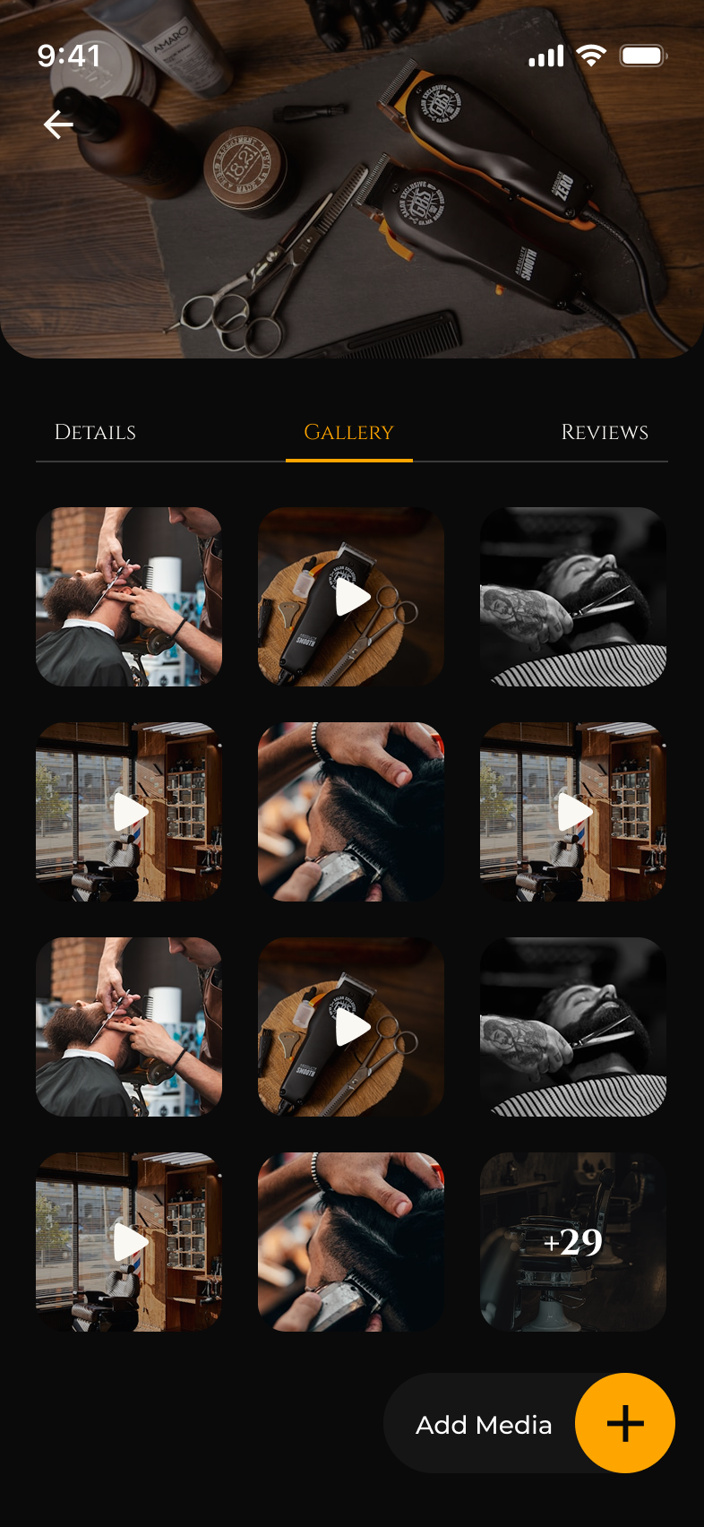
A 3-column media grid mixing photos and video thumbnails with a +29 overflow tile. Add Media floats on a pill so portfolio updates take one tap mid-service.
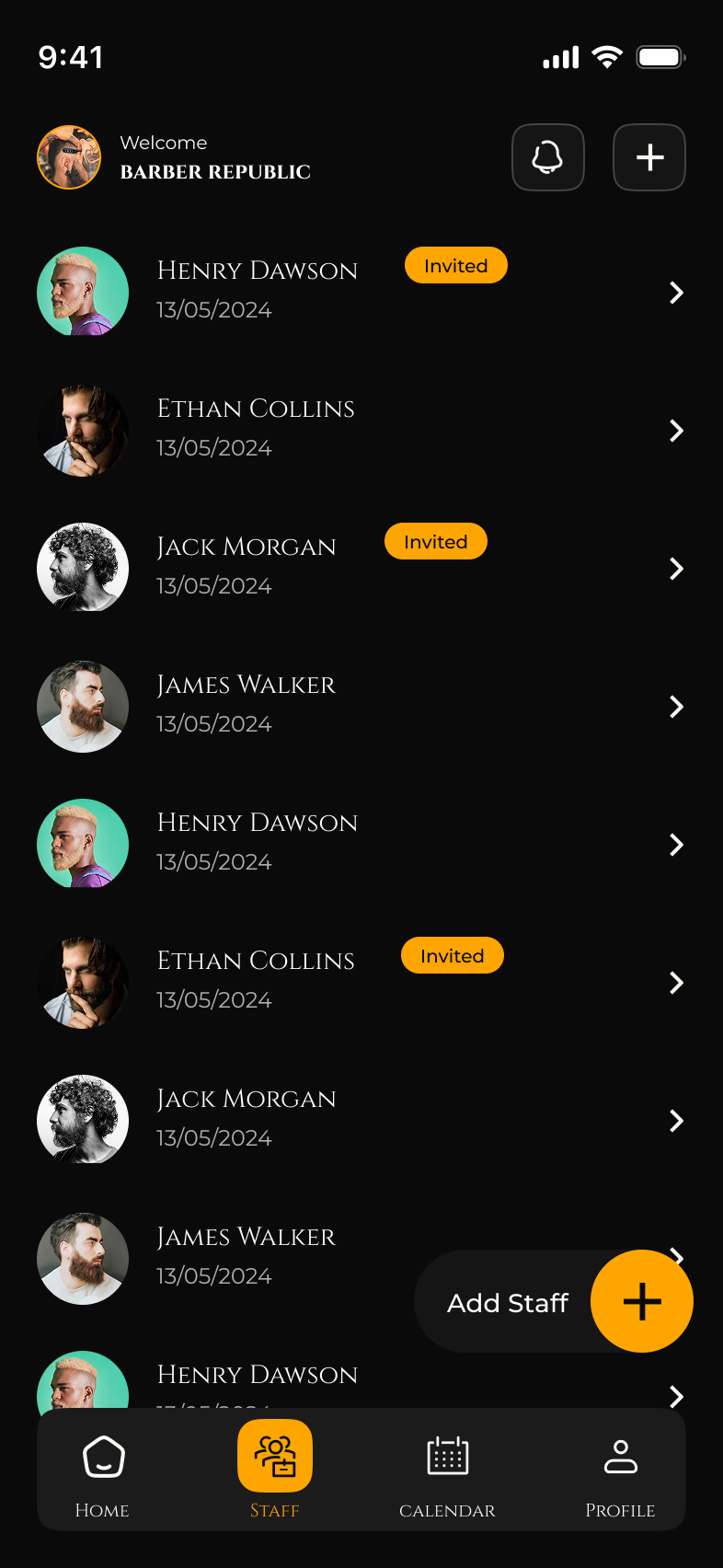
Invited barbers carry a gold Invited badge until they accept. A floating Add Staff pill sits over the list so growing the team never requires leaving the screen.
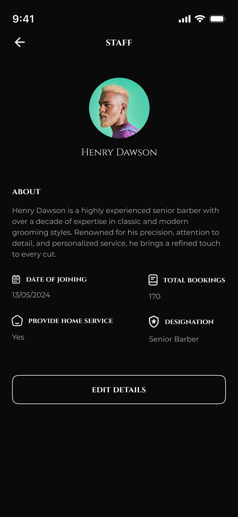
About copy, Date of Joining, Total Bookings, Designation, and the Provide-Home-Service flag — the same toggle that drives the User App's home-visit availability.
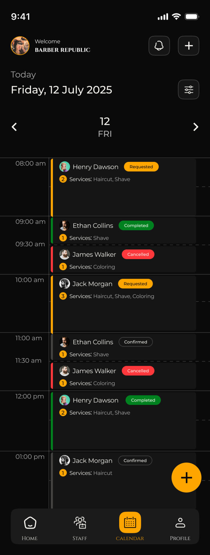
Day view with a colored rail per status: gold for Requested, green for Completed, red for Cancelled, outlined for Confirmed. Stacked time blocks make double-bookings impossible to miss.
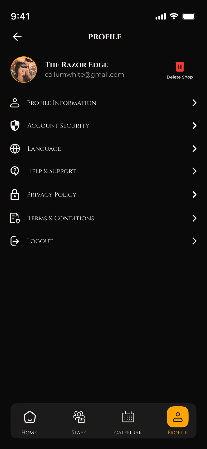
Profile Information, Account Security, Language, Help, Privacy, Terms, Logout — plus a destructive Delete Shop separated to the right of the avatar so it can't be tapped by accident.
Six choices shaped the operator app.
A bottom sheet with a checkmark on the active shop scopes every KPI, calendar, and staff list to it. One login, many shops — no profile-jumping.
Completed, Upcoming, Cancelled, Total Revenue, and Available-for-Withdraw sit above the fold. The Withdraw button is one tap from any screen.
Two segmented charts — a line for cash, a stacked bar for volume — both with Weekly / Monthly / Yearly toggles so seasonality is visible without an export.
Status drives the colored bar on the left of every booking block. Owners scan a day in under a second: gold to approve, green is money, red needs a phone call.
Adding staff sends an invite; the row carries a gold Invited badge until they accept. No silent pending state, no duplicate adds.
Delete Shop lives outside the settings list, in red, next to the shop avatar — visible enough to find, isolated enough to never be a stray tap.
One platform, two surfaces.
The Barber App shares the User App's gold-on-obsidian palette and the same editorial serif / humanist sans pairing — a shop owner opening both apps reads them as one product. Status colors double as the calendar rail: gold for Requested, green for Completed, red for Cancelled, outlined for Confirmed.
Both sides of the chair, shipped.
Together with the User App, the Barber App closes the loop: a guest's tap in one app lights up a Requested block on the owner's calendar in the other, with the same gold rail and the same status vocabulary. One platform, two surfaces, one design system.