Zulfy.
A premium barber and beauty booking app — find specialists nearby, book on-site or as a home visit, and manage every appointment from request to receipt.
- Role
- UI/UX Designer
- Type
- Mobile · User App
- Screens
- 10 final
- Tools
- Figma · Lovable · ChatGPT
Booking a barber should feel like booking a table.
Zulfy is a two-sided marketplace for grooming and beauty services. The User App is the client-facing half — a calm, photo-led booking experience that covers everything from finding a barber on the map to negotiating a home-visit price, on one continuous rail.
Most grooming apps treat mobile as a shrunken portal.
The on-the-go grooming client.
Clients who want their usual barber, their usual cut, their usual slot — and a one-tap rebook so the decision takes seconds, not screens.
Users discovering new salons by portfolio and reviews — gallery quality and rating density matter more than price.
Busy professionals booking a barber to the apartment. They need a transparent quote, a counter-offer surface, and an Accepted badge.
Wedding parties or families needing multi-service, multi-quantity bookings — handled inline with +/- steppers and a live total.
Four tabs, ten screens, zero menus.
Home holds discovery (list + map). Booking is the catalogue of nearby services. Appointment is the segmented status board. Profile is settings, favourites, and history. Modals cover Booking Details, Gallery, and Notifications.
Ten screens, one guest experience.
Each screen earns its place in the flow. Captions explain the decision, not the obvious.
The Zulfy mark on near-black — a gold scissors-and-silhouette monogram that signals 'premium barber' before a single word loads.
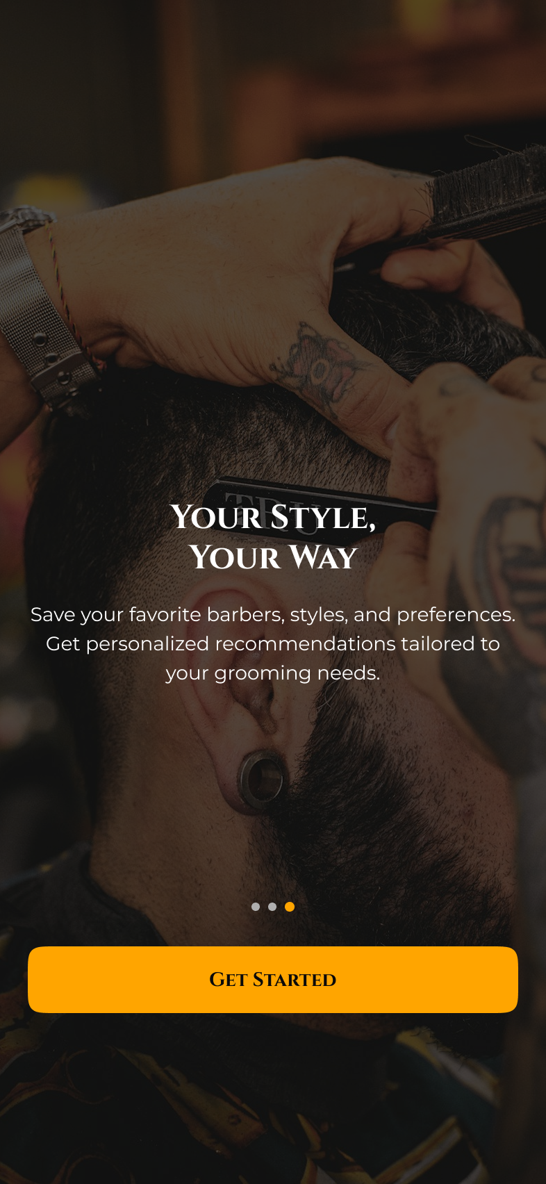
Three full-bleed photo screens carry the value prop ('Your Style, Your Way'). Pagination dots, one primary action — Get Started — no skip wall.
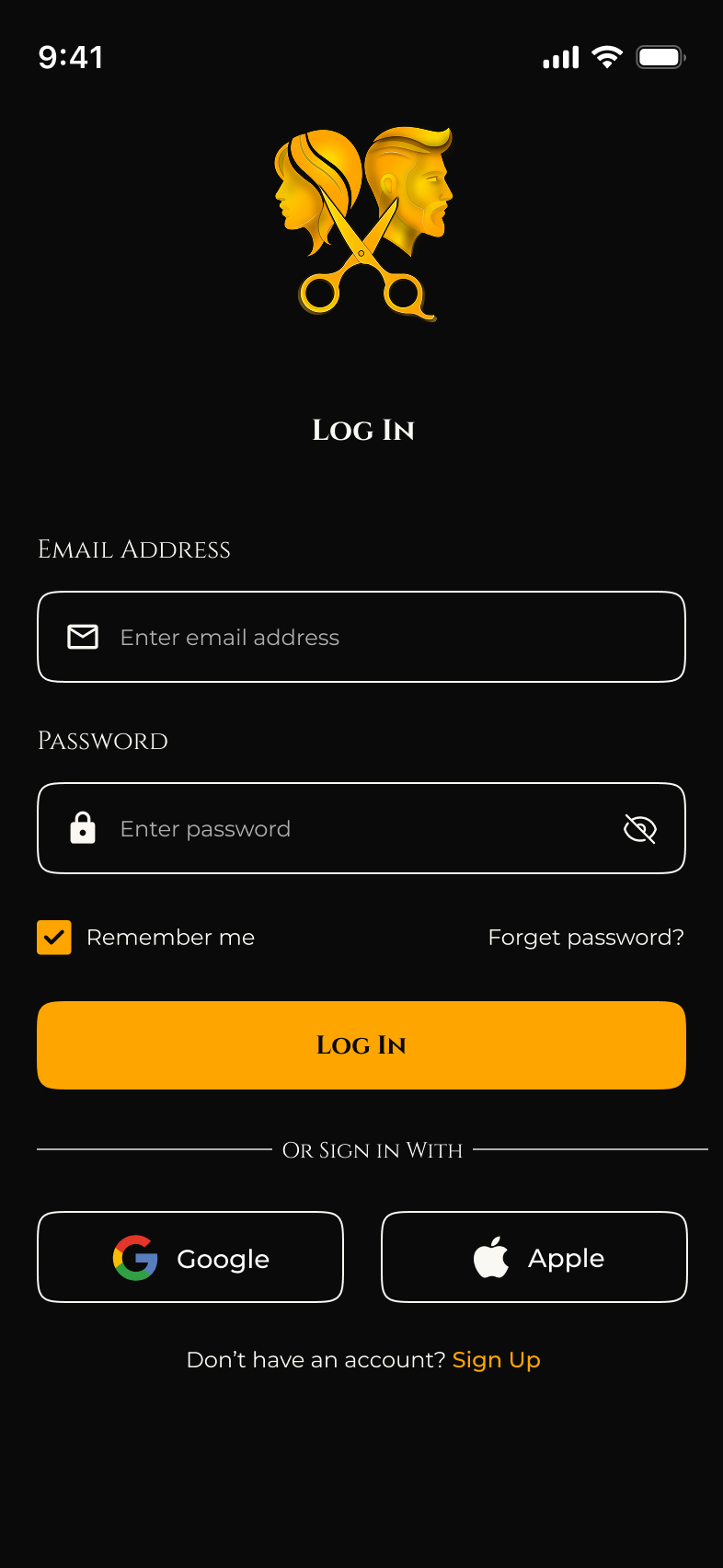
Single calm column: email, password with show/hide, Remember-me on by default, plus Google and Apple sign-in so first-time guests aren't gated by a form.
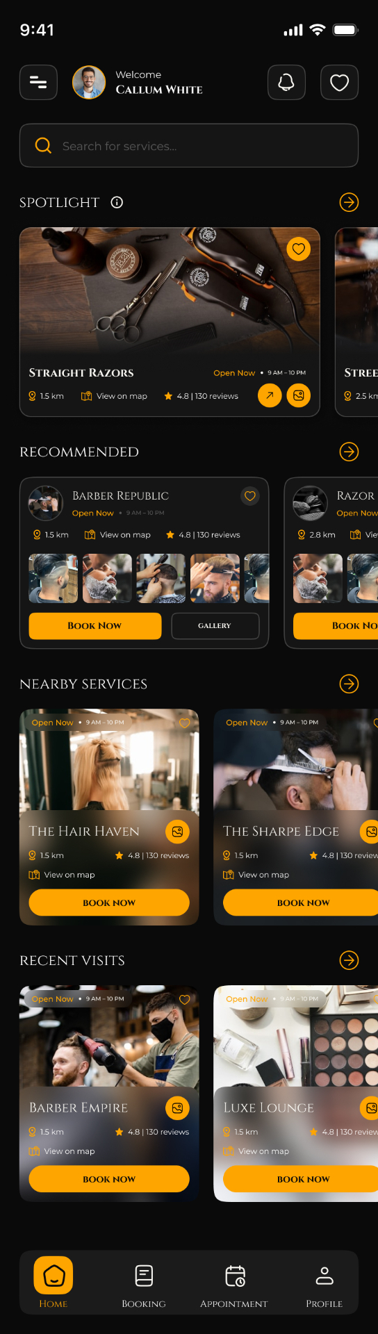
Welcome row, search, then a Spotlight carousel, Recommended salons with portfolio strips, Nearby Services, and Recent Visits — four scannable rails over one scroll.
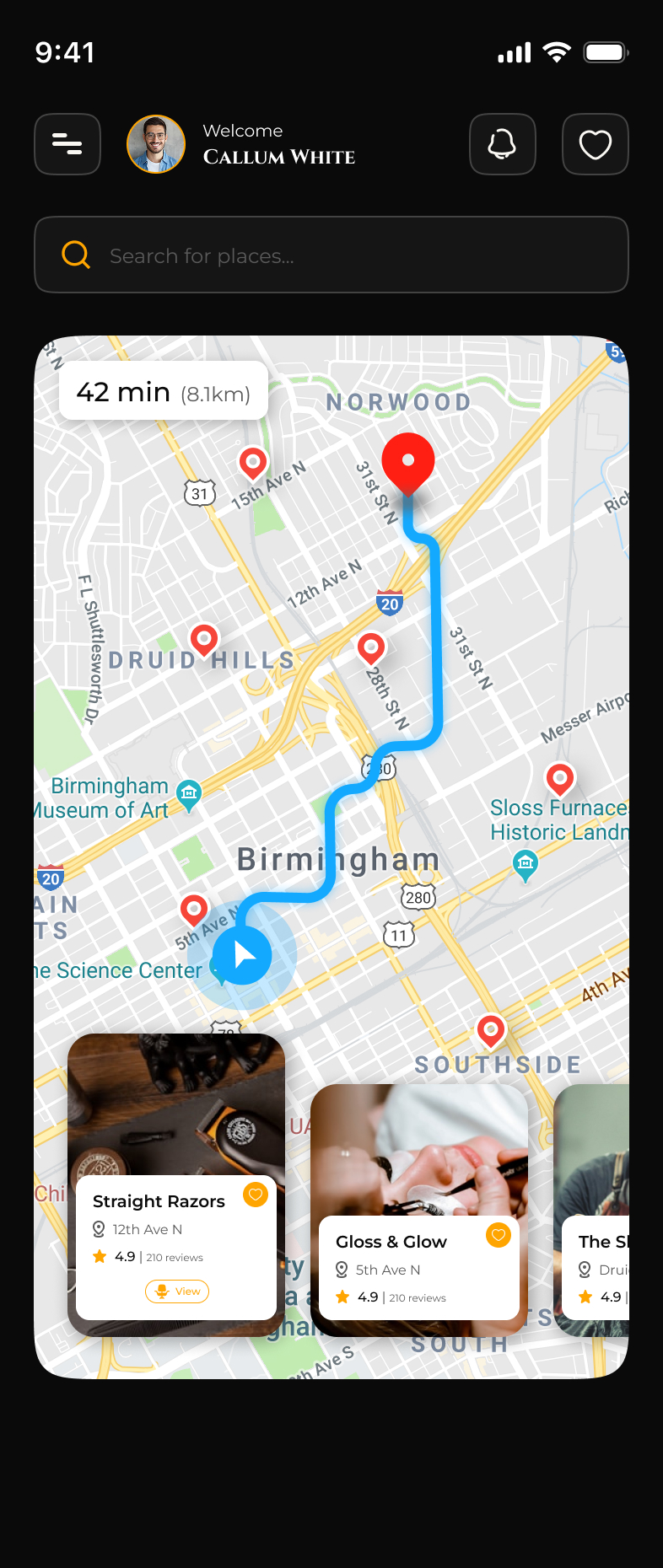
Same home, swapped to a map: live route, ETA chip, and a horizontal carousel of pinned salons at the bottom so distance and choice are visible in one glance.
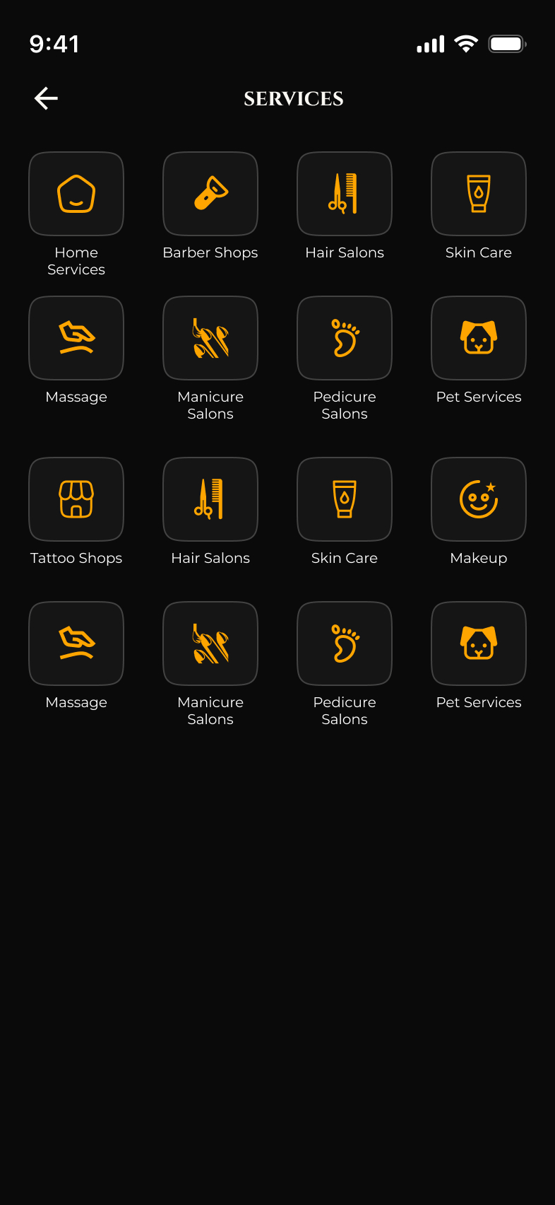
A 4-column icon grid (Barber Shops, Hair Salons, Skin Care, Massage, Pet Services, Tattoo, Makeup, etc.) — categories live as tappable tiles, not a dropdown.
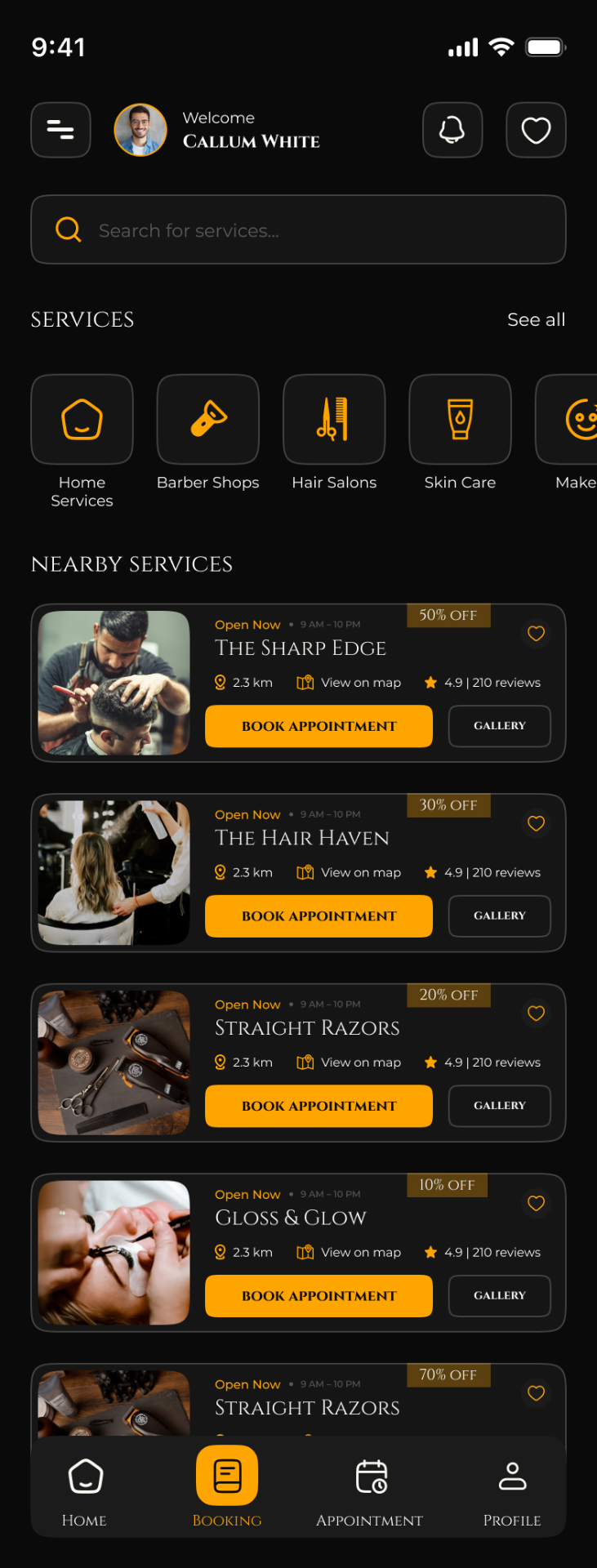
Card feed sorted by proximity: Open-Now badge, distance, rating, and the discount chip up top. Each card resolves into a Book Appointment or Gallery action.
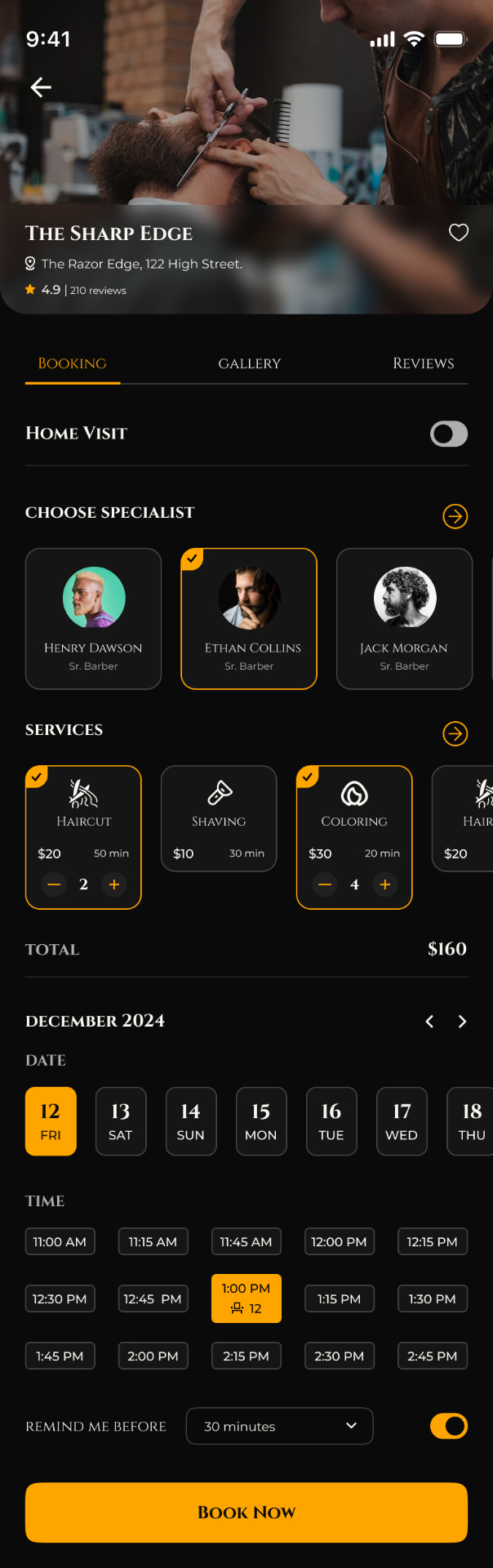
Hero photo, Home-Visit toggle, specialist picker, multi-service cards with +/- quantity, live total, calendar strip, time-slot grid, and a Remind-me-before nudge — the whole booking on one page.

Booking/Gallery/Reviews tabs over a 6-tile portfolio with video thumbnails, About copy, working hours and address — the salon's full pitch before the user commits.
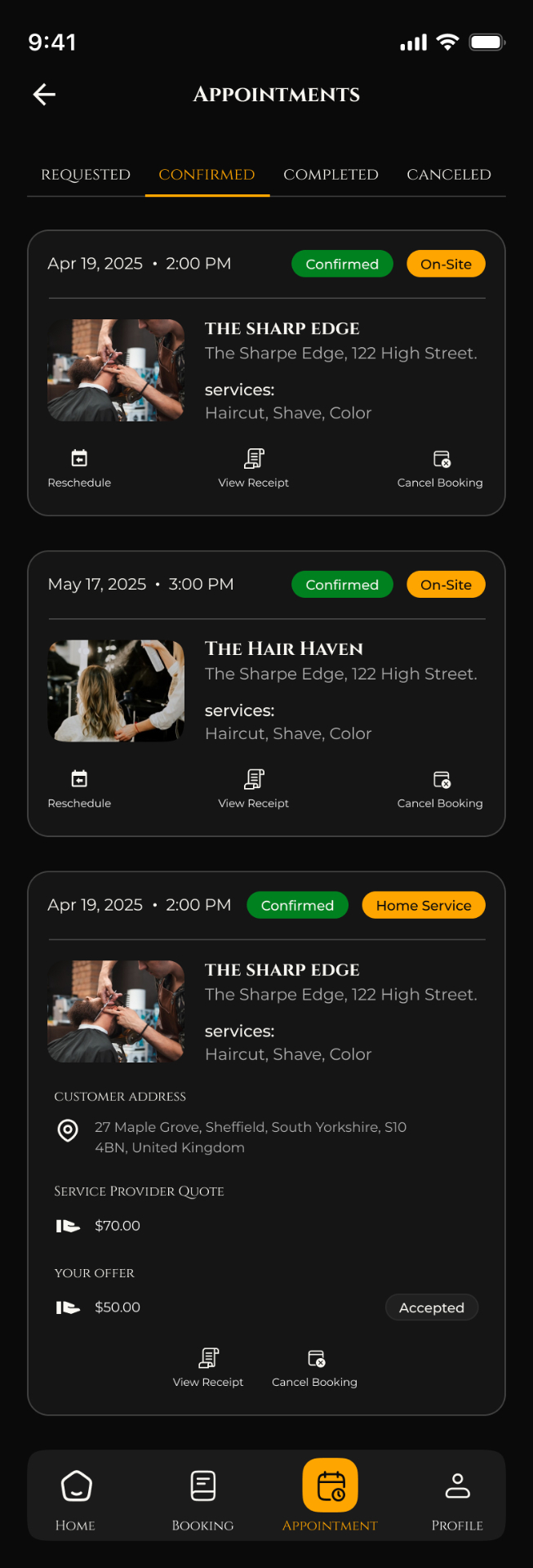
Requested · Confirmed · Completed · Cancelled segmented tabs. On-Site and Home-Service bookings render differently: the latter shows quote vs. offer with an Accepted badge.
Six choices shaped the app.
One switch turns an in-shop slot into a home service — the rest of the form (specialist, services, total) stays identical, so the price and time logic update without a new flow.
Haircut ×2, Coloring ×4 — each service is a card with +/- steppers and the total updates live above the calendar. No surprise totals at checkout.
Home offers both surfaces from the same data: scroll for editorial discovery, switch to map for proximity. The horizontal salon carousel anchors the map so taps don't lose context.
Requested → Confirmed → Completed → Cancelled is the spine of the Appointments tab. Each card adapts its action row (Reschedule, View Receipt, Cancel) to the status it shows.
Home-service bookings show the provider's quote alongside the user's offer with an Accepted/Pending badge — a price negotiation surface that's invisible on on-site bookings.
Google and Apple buttons sit alongside email — booking is an impulse decision, so any extra typing kills conversion.
Gold on obsidian, serif on sans.
A single Zulfy gold (#F5A623) carries every primary action, active state, and brand mark against a near-black canvas. Display headings use an editorial serif to lean into the 'premium barber' tone; body copy is a humanist sans for legibility at small sizes. Status uses a tight palette: green (confirmed), gold (on-site / home-service tag), red (cancelled).
The platform, in your pocket.
The User App is the first half of the Zulfy platform — a guest experience that turns 'I need a haircut' into a confirmed booking in under a minute, with a parallel Barber App (in design) picking up every request from the operator's side.