Serenepass.
A premium marketplace where locals and travelers discover and book day passes for hotel pools, spas, gyms and jacuzzis — designed to feel like an editorial magazine, not a booking engine.
- Role
- UI/UX Designer
- Type
- Web · Marketplace
- Timeline
- 3 weeks
- Tools
- Figma · Lovable · ChatGPT
A calmer way to book hotel leisure.
Serenepass is a hospitality product that opens up underused hotel facilities — pools, gyms, spas, jacuzzis — to non-guests through flexible day, weekly, and monthly passes. The brief was to turn what is normally a fragmented WhatsApp and phone-call experience into a confident, premium online booking flow.
Serenepass ships as four connected surfaces — Marketplace, Hotel Dashboard, Admin Dashboard, and Mobile App. This page covers the Marketplace; the Hotel Dashboard , Admin Dashboard and Mobile App live on their own pages.
Day-pass discovery is broken.
Built for two sides of the same problem.
Urban locals, remote workers, and tourists who want resort-grade facilities for a few hours — without a full hotel stay or a yearly membership.
Operations and revenue teams looking to monetize off-peak capacity without compromising the in-house guest experience.
What the category gets wrong.
One spine, eight steps.
Iterations that shaped the layout.
Editorial luxury, not corporate booking.
The palette pairs a deep navy with a heritage gold over warm cream — closer to a boutique-hotel brand book than a SaaS dashboard. Display serifs carry titles, a humanist sans handles UI, and photography stays full-bleed so the venue does the selling.
Ten screens, one guest experience.
Each screen below earns its place in the flow. Captions explain the decision, not the obvious.
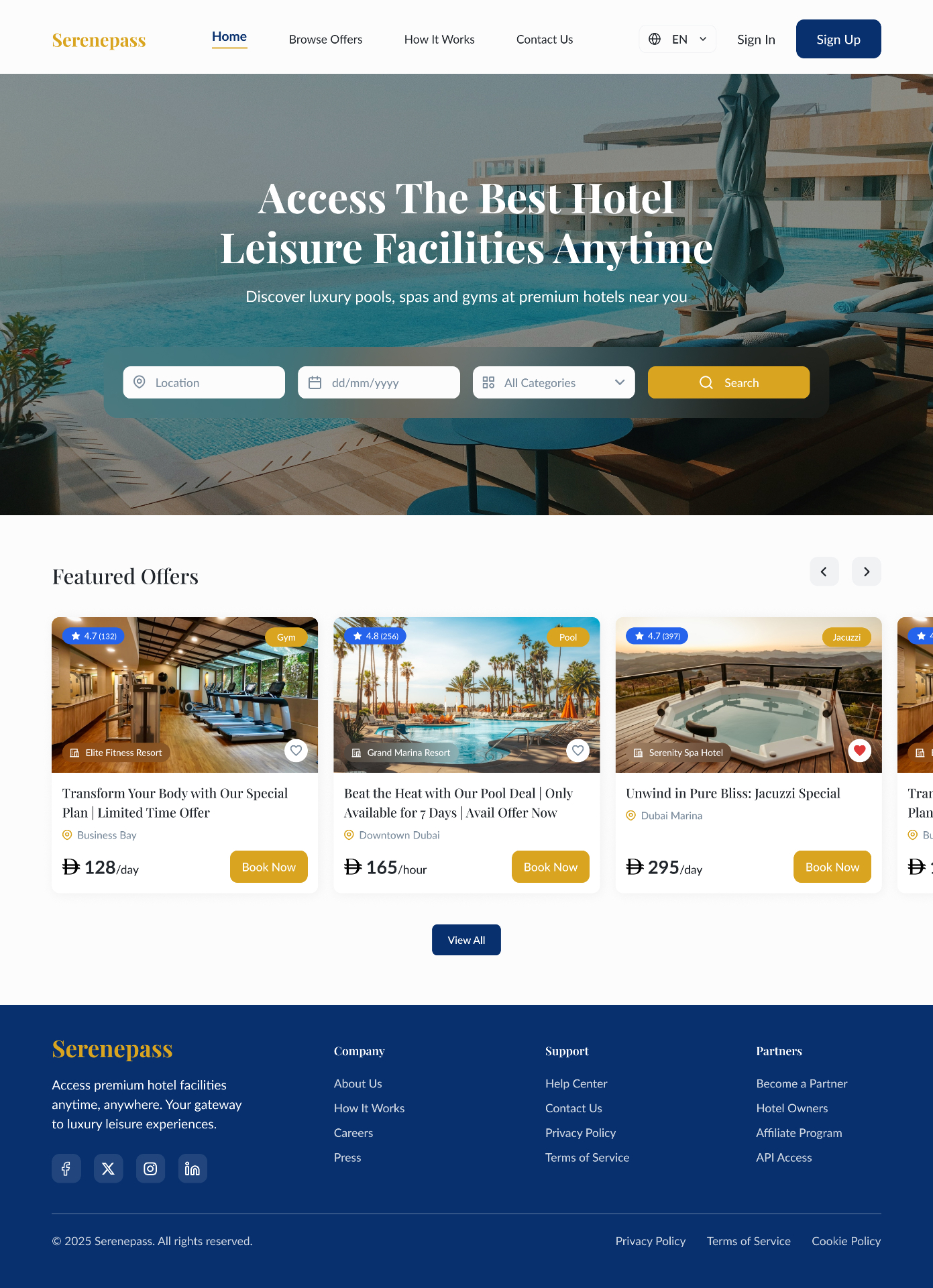
Cinematic hero + a single search bar with three inputs (location, date, category). Featured offers carousel below sets the editorial tone immediately.
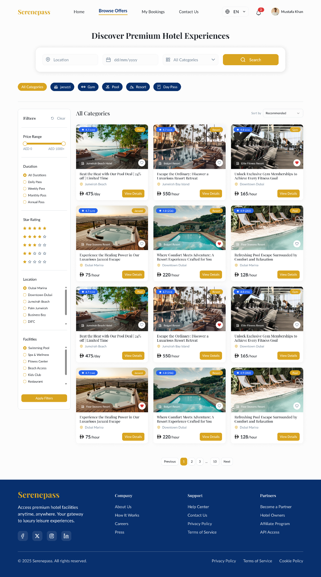
Category chips above, left-rail filters for price · duration · star rating · location · facilities. The grid stays uncluttered with consistent card heights.
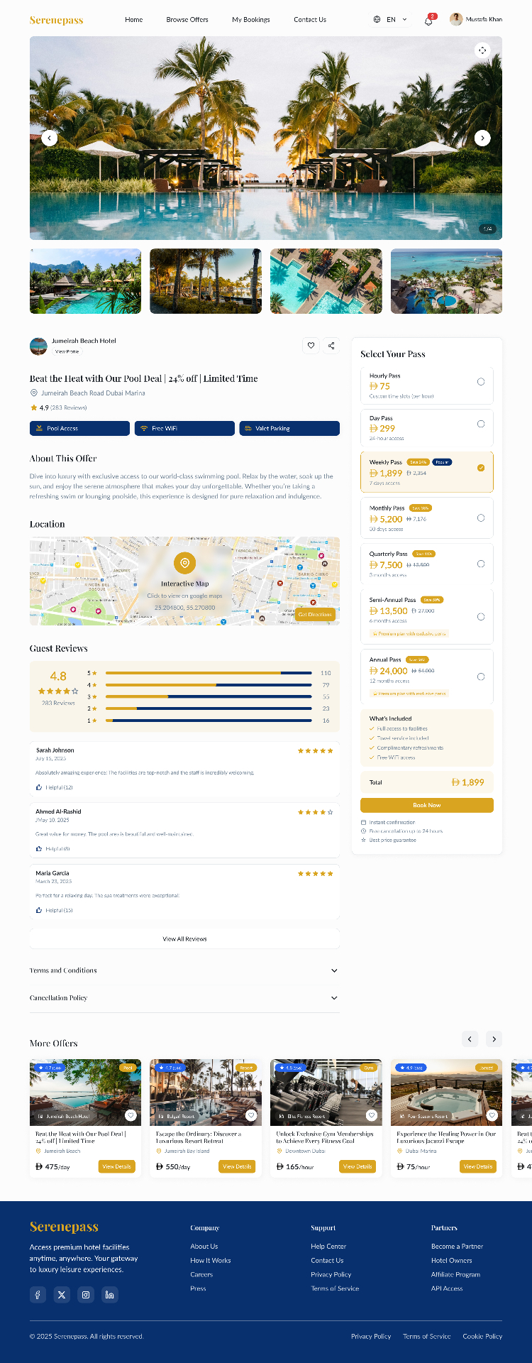
Gallery, amenities, an interactive map, and guest reviews on the left; a sticky pass selector with savings badges on the right. The CTA never leaves the viewport.
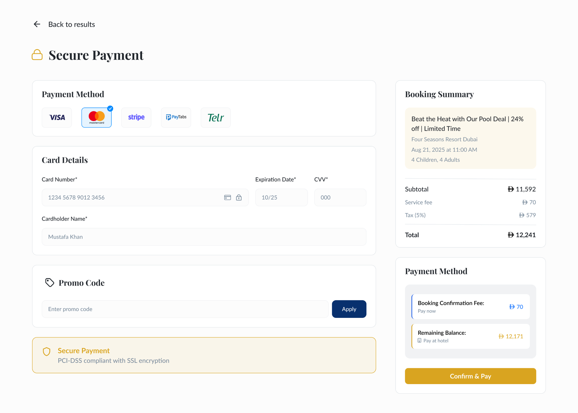
Payment method tiles, card form, promo code, and a permanent booking summary. The split between 'booking fee now' and 'balance at hotel' is the trust mechanic.
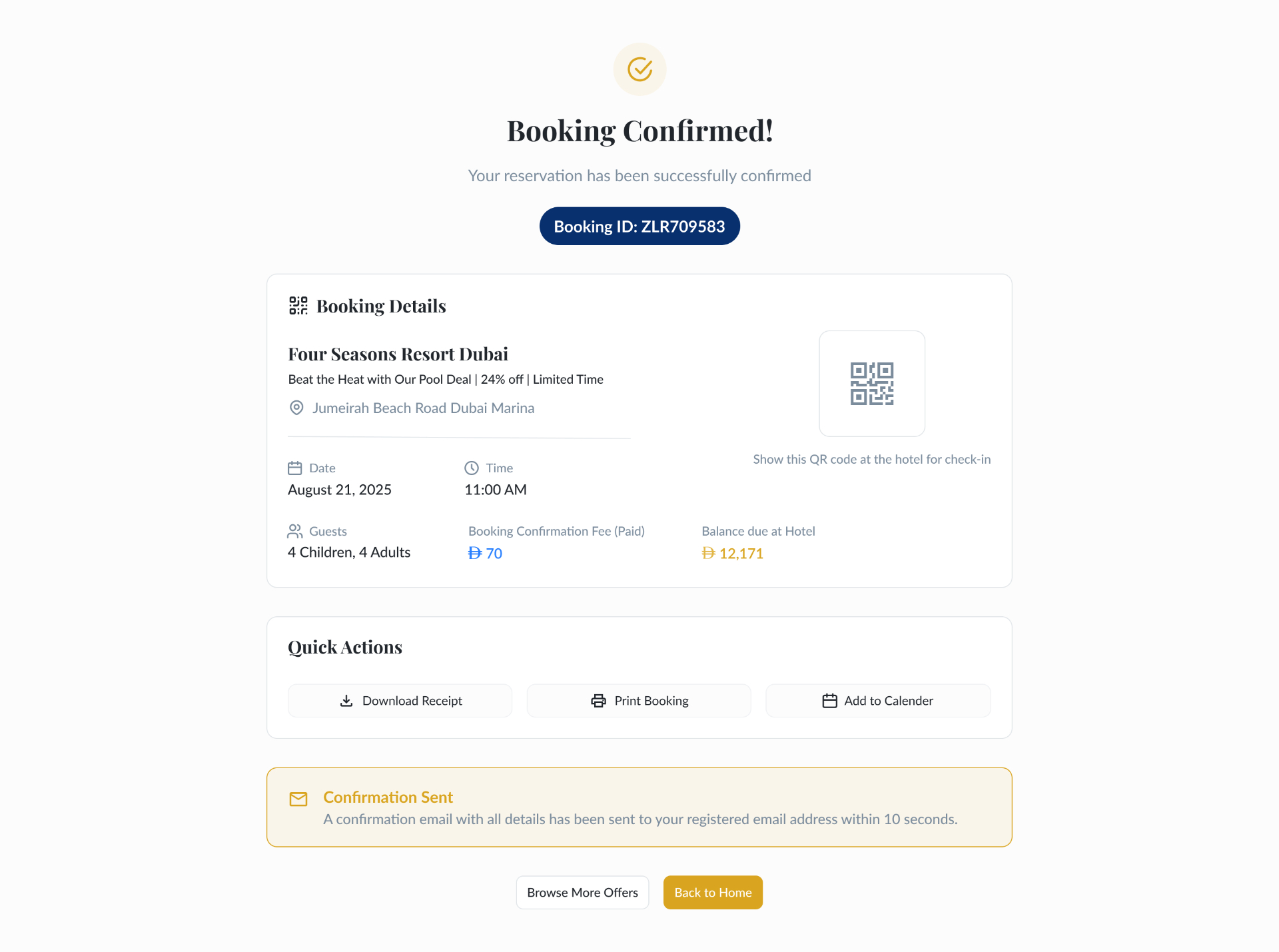
A QR code becomes the check-in ticket. Quick actions (download · print · add to calendar) cover every guest's recall strategy.
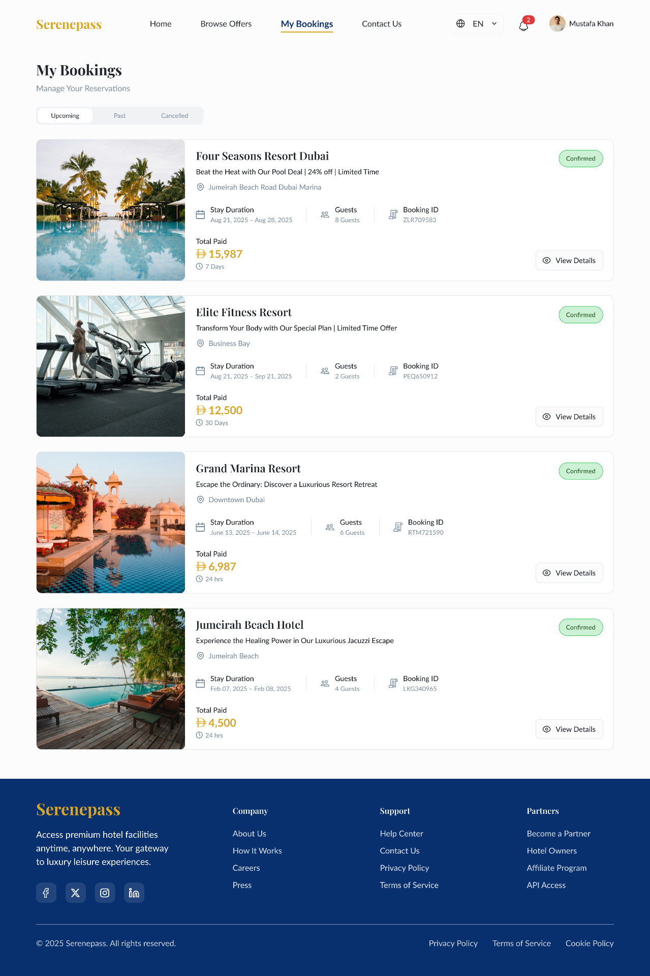
Upcoming · Past · Cancelled tabs. Each card surfaces stay duration, guests, booking ID and total paid — the four questions support is always asked.
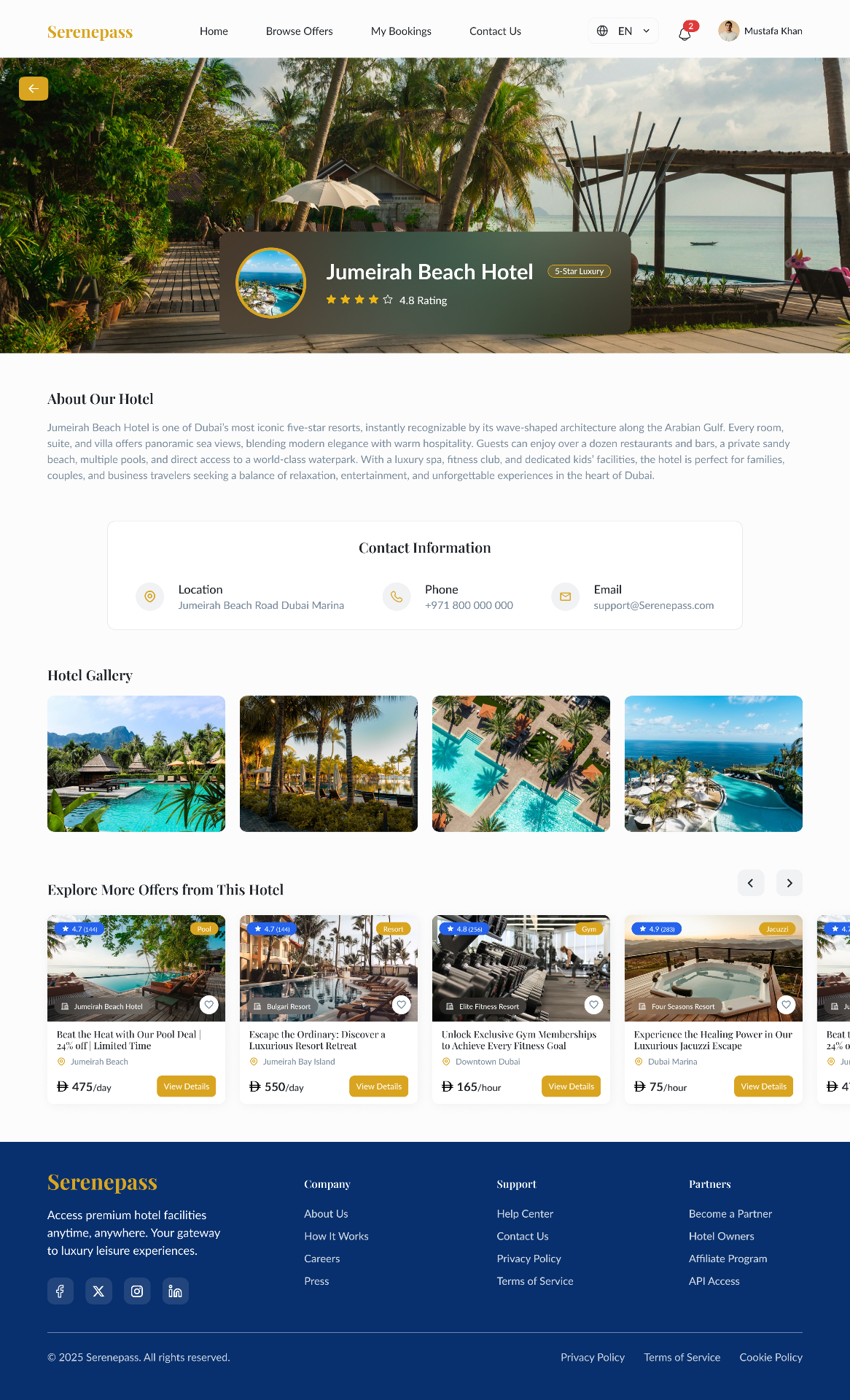
A standalone brand page for each property — full-bleed cover, gallery, contact, and a horizontal carousel of every offer that hotel runs.
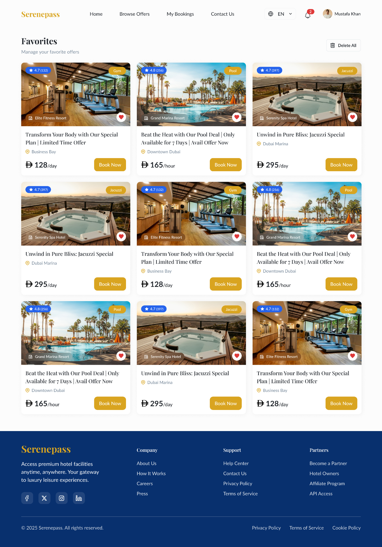
Save-for-later as a first-class page, not a hidden menu. Same card system as Browse keeps the visual rhythm consistent.
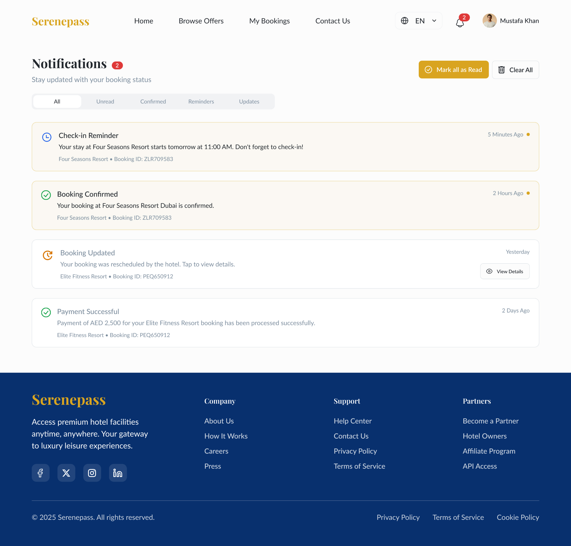
Typed notifications (Reminder · Confirmed · Updated · Payment) with an unread state. Tap-through goes straight to the relevant booking.
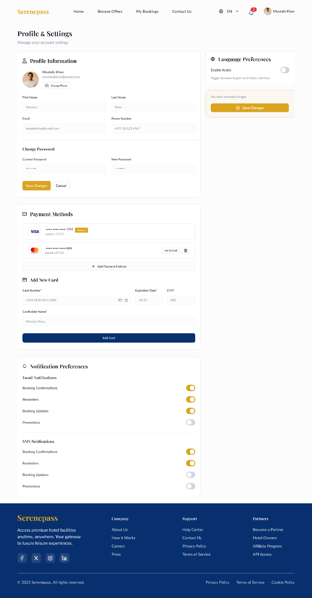
Profile, saved cards, and a notification matrix in one scroll. The 'You have unsaved changes' sidecar prevents silent data loss.
Six choices that shaped the product.
The right-rail pass picker stays in view so price, savings, and Book Now never disappear during long offer pages.
A small booking fee online + balance at the hotel reduces checkout anxiety and matches how day-pass venues actually operate.
Confirmation doubles as the entry ticket — no app, no email scrolling at the front desk.
Every pass shows a 'Save %' badge against the listed rate so users feel the value at a glance.
Upcoming · Past · Cancelled removes a layer of mental filtering for repeat users.
Channel × type matrix (Email / SMS) keeps reminders useful without becoming noise.