Mobile App.
The guest-facing companion to the Serenepass marketplace — a calm, one-thumb booking experience that brings the same editorial visual language to a 6-inch screen.
- Role
- UI/UX Designer
- Type
- iOS · Guest App
- Screens
- 10 final
- Tools
- Figma · Lovable · ChatGPT
A booking flow that fits one thumb.
The mobile app is the natural home for Serenepass — most day-pass decisions happen on the way to brunch, between meetings, or at the pool gate. The iOS app mirrors the marketplace's editorial tone while collapsing every flow into thumb-reach.
It connects to the same Hotel Dashboard and Admin Dashboard that power the web Marketplace.
Mobile-first guests, web-first competitors.
The on-the-go decider.
Weekend planners who decide an hour before, often while already in transit. They need confirmation, a QR ticket, and directions without context-switching apps.
Short-stay visitors comparing facilities near their hotel. They lean on photography, reviews and transparent pricing — not loyalty programs.
Four tabs, ten screens, zero menus.
The whole guest journey collapses into a four-tab bottom nav — Home, Offers, My Bookings, Profile — with modal stacks for Offer Details, Checkout, Hotel Profile and Notifications. No drawer, no nested settings, no "more" tab.
Ten screens, one guest experience.
Each screen earns its place in the flow. Captions explain the decision, not the obvious.
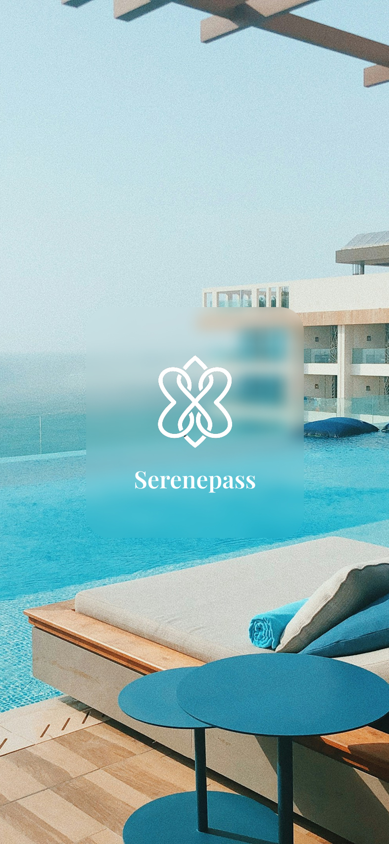
A glass-on-water brand moment — the wordmark sits inside a frosted card over a real pool scene, setting the editorial tone before the first tap.
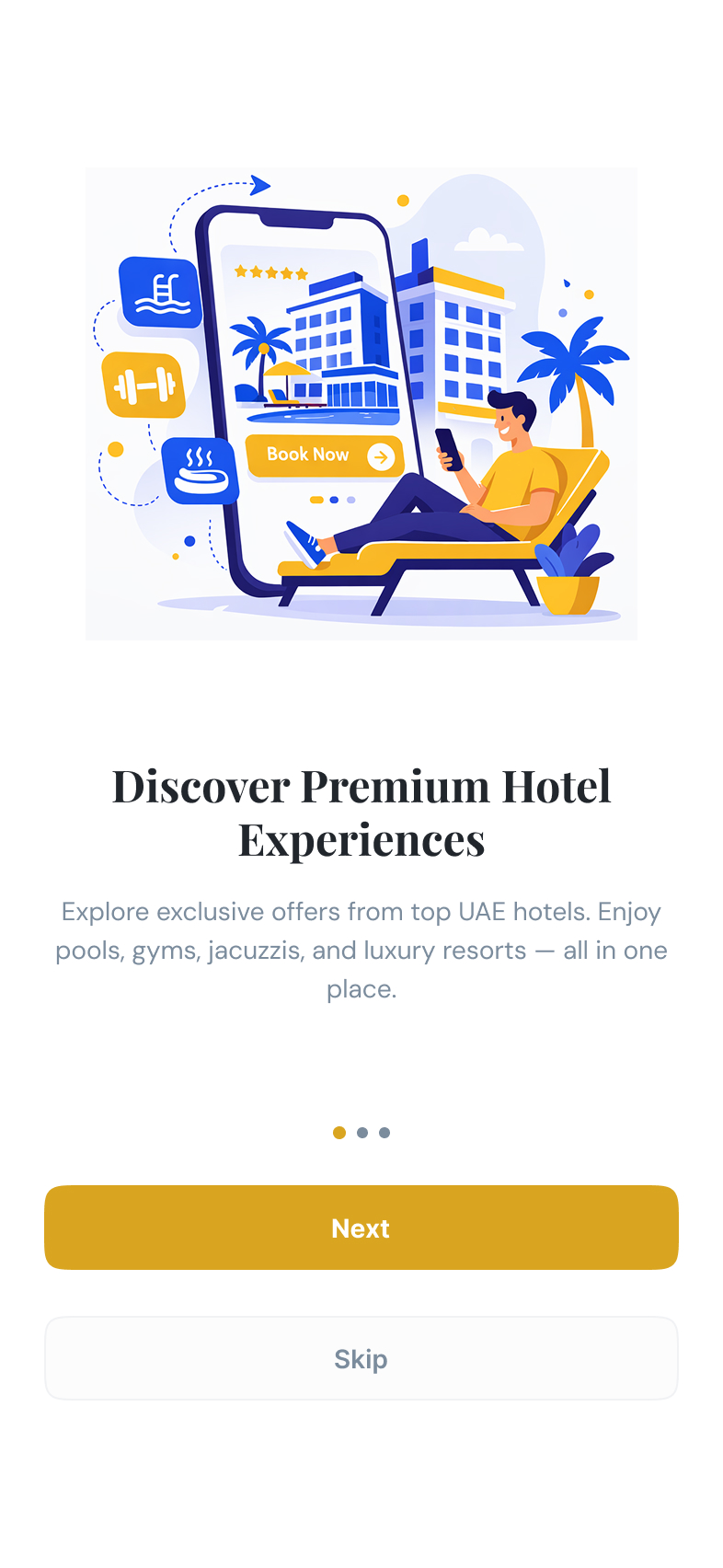
Three illustrated screens cover the value prop, the pass model, and the booking flow. Skip is always one tap away to respect returning users.
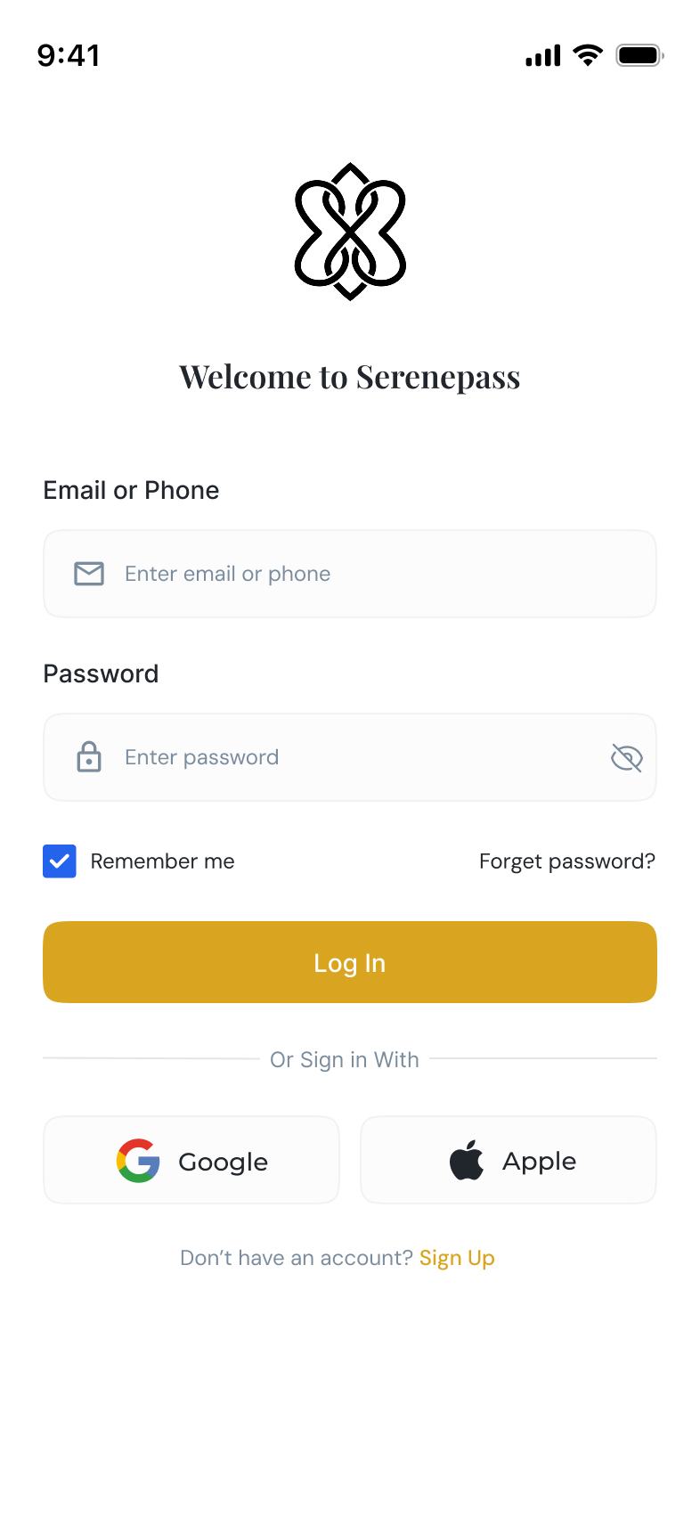
Email or phone in one field, password with show/hide, Remember me on by default, plus native Google and Apple sign-in for friction-free re-entry.
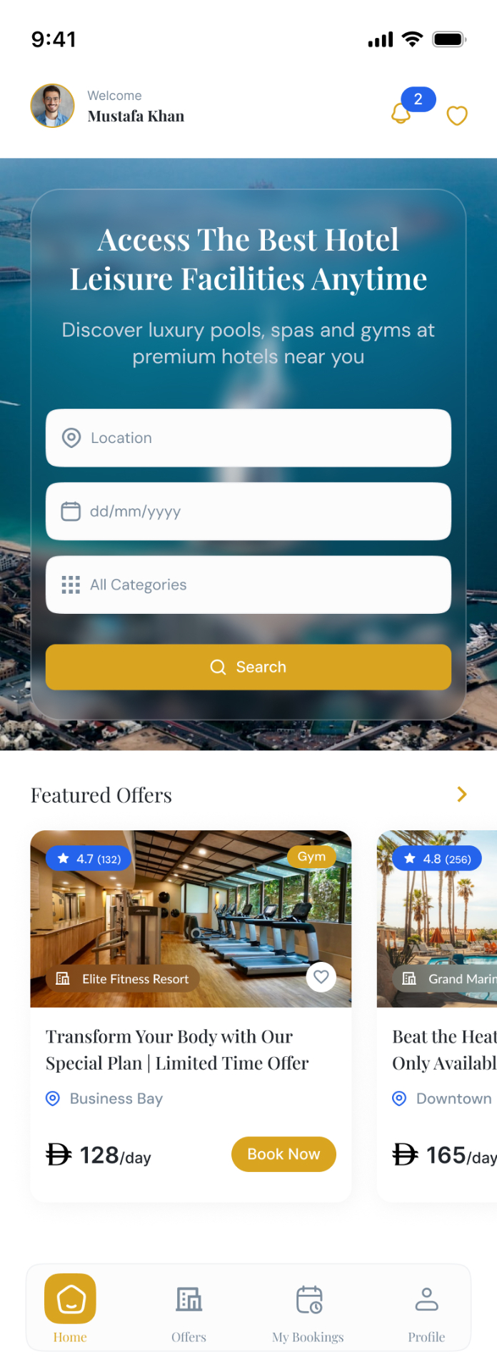
Personalized greeting, a glassy search card with location · date · category, then a Featured Offers carousel — the same editorial spine as the web app, sized for one thumb.
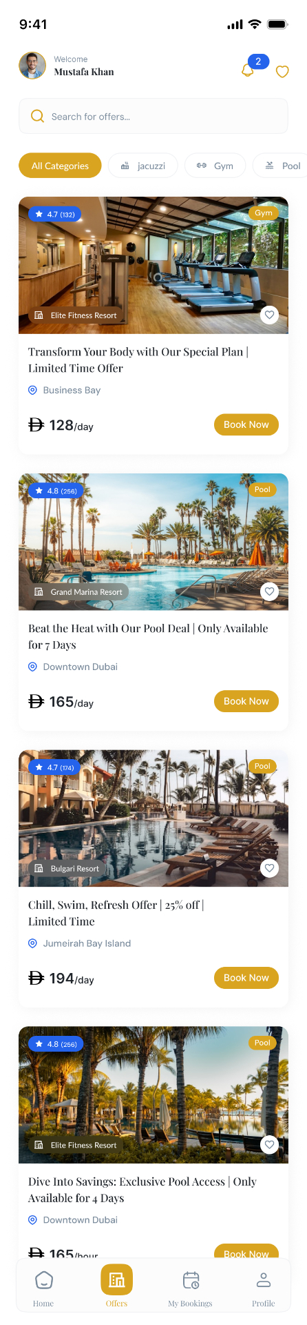
Search bar + horizontal category chips above a single-column card feed. Each card carries rating, hotel, location, price and a primary Book Now — no second tap to decide.
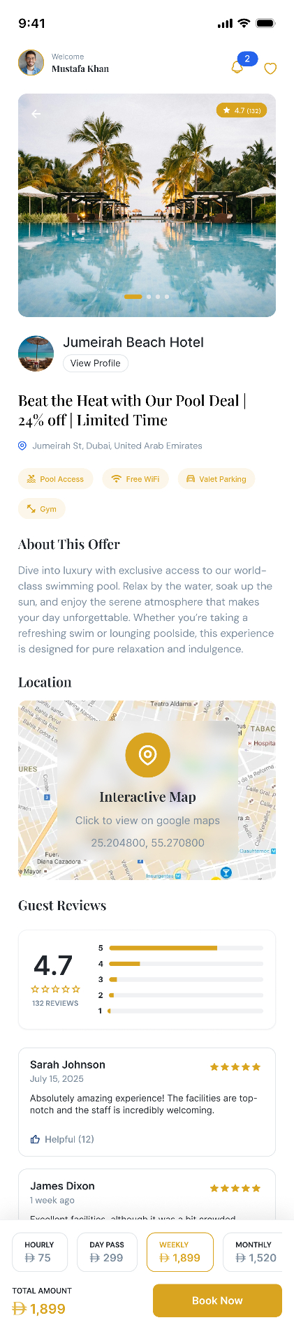
Gallery, amenity chips, description, an interactive map, and reviews — all scrollable above a sticky pass selector + Book Now bar that never leaves the viewport.
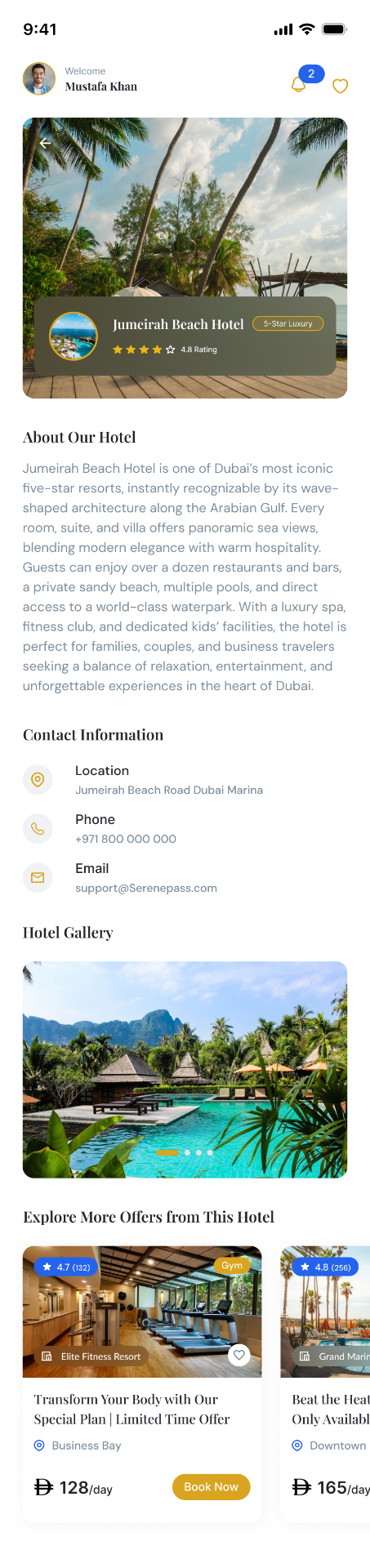
Standalone brand page per property: cinematic cover with badge card, about copy, contact rows, gallery, then a carousel of every other offer that hotel runs.
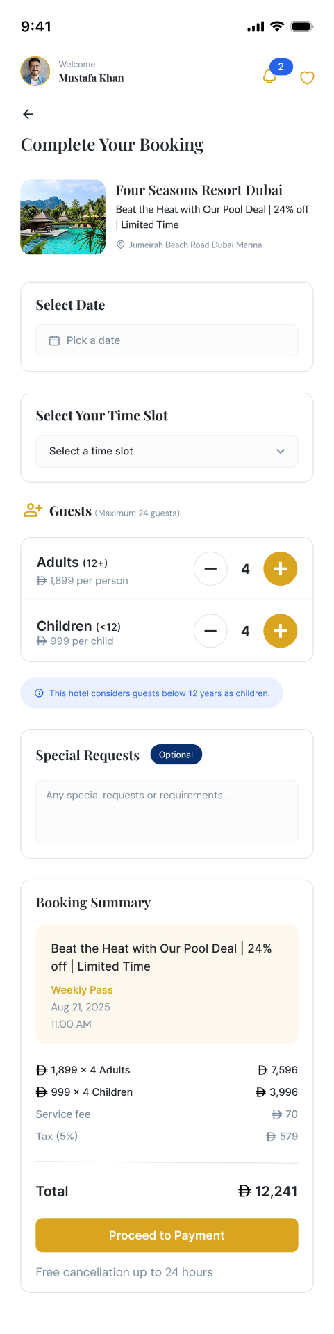
Date, time slot, +/- guest steppers, optional special requests, and a permanent Booking Summary card with the live total — no surprises before Proceed to Payment.

Upcoming · Past · Cancelled segmented tabs. Each card surfaces stay duration, guests, booking ID and total paid — the four questions support always gets asked.
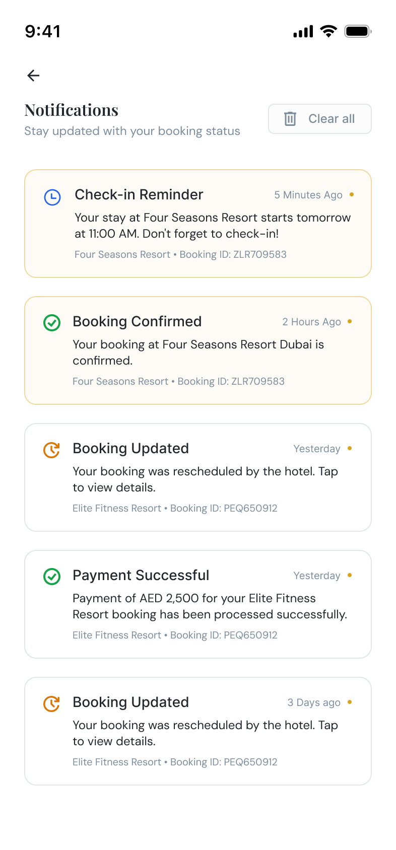
Typed alerts (Reminder · Confirmed · Updated · Payment) with iconography and unread highlighting. Tap-through goes straight to the relevant booking, not a menu.
Six choices shaped the app.
On Offer Details the Hourly/Day/Weekly/Monthly selector and Book Now stay pinned to the bottom — total amount is always one glance away.
Checkout keeps the line-item breakdown visible while you edit dates and guest counts, so the total updates in front of the user instead of after a tap.
Home · Offers · My Bookings · Profile sit in a floating capsule. Four tabs, thumb-reach, no hidden hamburger.
Bookings split into Upcoming / Past / Cancelled removes a layer of mental filtering for repeat users opening the app between visits.
Blue for time, green for success, gold for changes — the type is readable before the copy is.
Google and Apple buttons reduce the cold-start tax for first-time guests booking on the go.
One palette, two surfaces.
The mobile app inherits the marketplace's heritage gold + deep navy on warm cream — same display serif for titles, same humanist sans for UI. Components are re-scaled, not re-skinned, so a guest moving between web and mobile never feels they've switched brands.
The platform, in your pocket.
The Mobile App completes the Serenepass platform — Marketplace for discovery, Hotel Dashboard for operators, Admin Dashboard for the team, and now a guest app that turns "I should book that pool day" into a confirmed booking in under a minute.